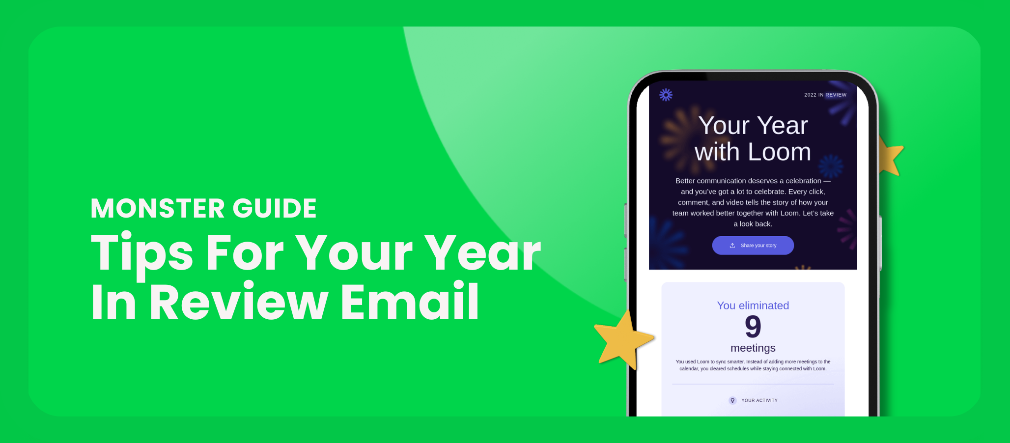
As last year came to a close, we got a number of exceptional year in review emails. These uber-personalized sends often include graphs, data and visualizations that help us take a look back at our relationship with a brand. The best ones help you to see how much a particular service or platform was a part of your life. They delight by re-imagining your customer data in new ways. Here are a few of our favorites:
Brand: Upwork
What we love about it:
With bright, eye-catching color blocks, this gridded year in review email stood out. We especially love its creative copywriting. The opening paragraph (while a little lengthy) hooked us in with the wacky picture that it painted. Even though we’re not power users of the Upwork platform, the stats kept our interest with their quippy subheads. Delicious data, indeed!
Brand: Mirror/Lululemon Studio
What we love about it:
This sleek email gives an amazing weekly snapshot of your workouts, along with a yearly look back with quick-to-understand bar charts. It manages to effortlessly blend your own data with some marketing content, encouraging referrals and making a customer service contact simple.
Brand: Delta Skymiles
What we love about it:
Air travel stats are irresistible and Delta has managed to wrap up the year with a beautiful recap email. The background imagery helps to bring together what can sometimes seem like a disconnected group of data points. Weaving in the stats of the larger Skymiles community is a nice touch for those who have less meaty numbers to dig into.


