“Don’t use free in the subject line. It’ll land you in spam.” This advice came and went about 10 years ago, along with One Direction (sorry, 1D!). Like many things in our world, subject best practices have gotten more… complex. But a well-crafted subject line is arguably the most important creative element of your email–so it should get the most care and attention.
Don’t make it an afterthought.
In terms of creative workflow, a lot of effort goes into creating a well-designed, on-brand email, obsessing over each and every pixel. It’s tempting to just slap a subject line on as a final step. We understand, email can be exhausting. But it’s worth the effort to flip the script and think through a strategy up front.
Build a testing strategy and be rigorous.
Here’s where we give slightly annoying advice: Everything depends on your audience. Throw all the best practices in the world out the window and create a rigorous testing strategy that includes moments to document the results and adjust your approach. You’ll likely need a different approach for communications types, since what works for a monthly newsletter will be completely different than what works for a one-off promotion. It’s a subject line, so we only care about open rates, right? Nope, keep click through rates, send times and audience into account with your testing plan as well.
Pay off your subject line’s promise.
Misleading subject lines that get good opens but don’t incent your customers to act aren’t what we’re going for here, which is why click through’s matter. In addition to diluting the trust that you’ve built with your customers, this can also trigger spam traps and lead to deliverability issues.
Think about the whole package.
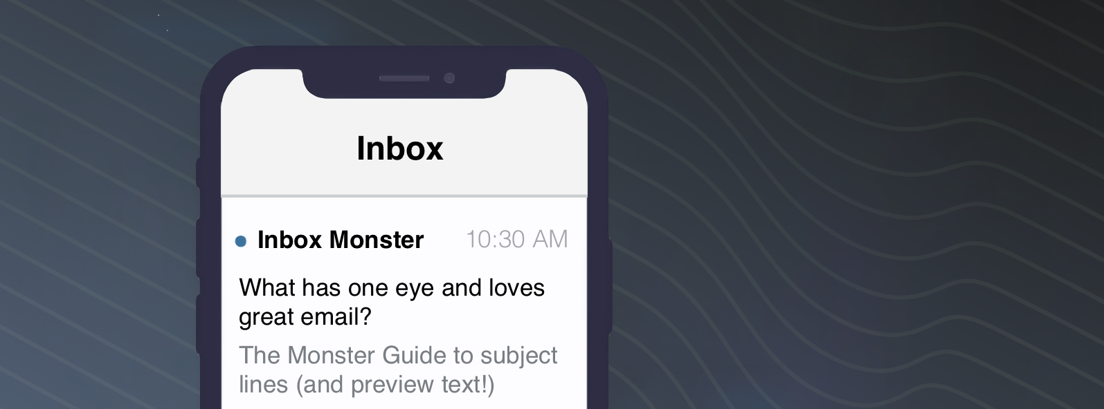
Your “from” name and preheader/preview text, combined with your subject line, should work in concert to get your message opened. (The preheader was traditionally the first line of copy, and it gets pulled into a preview pane in the inbox for most email clients.) With larger screen sizes, preview real estate is growing for some openers, but it can vary wildly from 40 to 140 characters. If you want to test into a longer preview text, consider hiding or pinning it, so it doesn’t visually show in your email. This may be a feature of your ESP or something that can be done easily in code. It is quite common and is no longer the deliverability concern it once was.
Keep it pretty short, and “front loaded” with key terms.
It goes without saying that people are short on attention and time. Keeping your line punchy, around 35 characters total, has been proven to be the most impactful for many audiences. (Even so, A.B.T.–always be testing.) Considering the wide variety of ways that email clients will display your subject line and the even wider variety of screen sizes, mobile and desktop, prioritizing the most important content at the beginning of the line makes good sense.
Get creative with how you personalize.
Often our customers give us data and signals far beyond first name. These can be great ways to personalize your subject line and have a greater impact. Maybe they’ve shown interest in a particular topic or they’ve made a recent purchase? These are all great ways to go beyond first name and show that you really are listening and responding to their needs.
Have a different strategy for engaged and unengaged audiences.
Try a different approach with those who are not responding to your brilliant subject line techniques and emails–an exclusive content or promotion is often a great tactic. You could also choose to use emotion or humor to recognize that they aren’t engaging. Think: “We’ll miss you around here” or “Was it something we said?”
Do a pre-deployment test.
The best way to know if anything in your subject lines is going to tip off spam filters or otherwise damage your reputation is to simply run a pre-deployment test. Use a data-rich tool like Inbox Monster can help you ID any content or subject lines that might get you into trouble– before you send your message.


