Two years after Elon Musk announced that he was buying X (“formerly known as Twitter”), and after several turbulent changes in management and operation, how have newsletter senders adapted to this branded switch? We checked how some of the most popular newsletters in the world use or showcase the social network in their ongoing campaigns and welcome emails in April 2024.
Morning Brew

With more than 4 million subscribers, one of the biggest and most popular daily newsletters out there, Morning Brew, still hasn’t changed the “formerly known as Twitter” logo in their footer. It’s even more interesting to notice that the writers’ links in the footer section are connected to their X accounts (rather than any other platform, or an internal page on their own website). In addition, the separate, shareable sections in each newsletter still have the old logo when referring to X. Digging even deeper, the bird symbol is still present all across Morning Brew’s website.
Really Good Emails
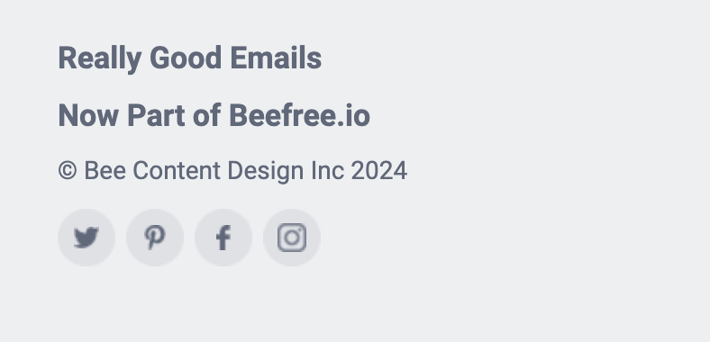
The recently acquired infinite source of email inspiration for marketers has yet to change its footer as well. It’s interesting to note that the “Now Part of Beefree.io” is a new addition to the footer (a matter of a couple of weeks), but the Twitter/X logo has yet to be changed. Looking at the website of their email marketing platform, Cordial, they seem not to have changed the same logo either. It begs the question: could some email service providers just not prioritize changing or adding the new X logo to their systems? Or is it available, but not something these brands care about changing?
James Clear
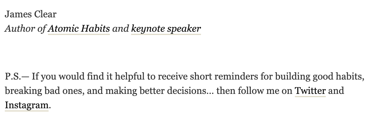
The “Atomic Habits” best-seller author sends his 3 million subscribers his popular “3-2-1 newsletter” every Thursday, where he shares 3 of his own short ideas, 2 quotes from others, and 1 question for readers to think about. When one joins his list, they can see a link to follow Clear’s “Twitter” account – no logos included. His ongoing newsletters contain a call to action to share one of his 3 thoughts on Twitter, yet again.
Hubspot

Hubspot’s newly branded marketing newsletter, The Lead, is one of the only examples in this list where one can see the new X logo in the footer of each email. But is it something that 600,000+ readers even notice or care about? It’s hard to say, especially when so many other newsletters are still using the old branding and terms of the previously known as Twitter.
Dollar Shave Club
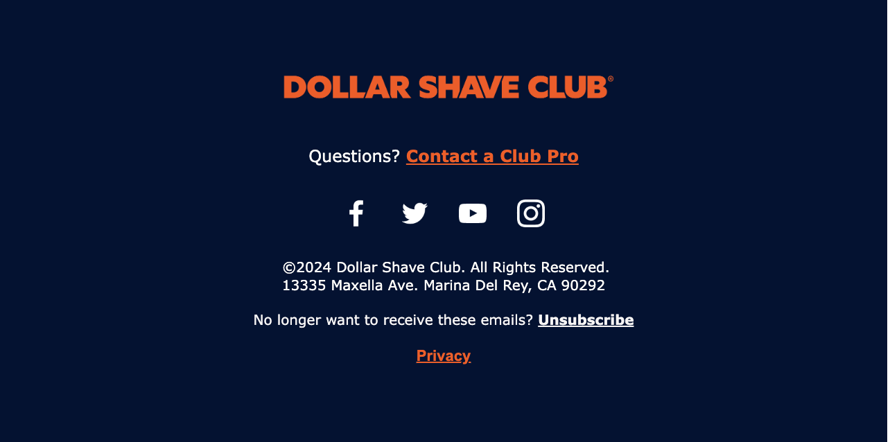
The household name, Dollar Shave Club, is following the footsteps of many in this list by not changing the Twitter logo in their email footer. When it comes to big retail and D2C brands, there’s a slight shift in this paradigm and more of a 50-50 division between those who have and haven’t switched to the new logo. Among those who switched, one can find brands like Target, Shein, and Allbirds, whereas brands like Peloton, Bonobos, and Hims & Hers Health are still sticking to the old branding.
TL;DR
it seems like many in the email community are far from being happy with X’s new management, and they rebel against it in their own, somewhat quiet way, through every campaign. Sure, some must have forgotten all about updating the logo. But we can’t ignore the fact that Twitter, in its former alteration, was one of the leading platforms for brands of all sizes to build and grow their audiences – something that Twitter encouraged and supported in various ways. Now, with its new management, many brands feel like the platform is not supporting their growth or efforts as it used to. Not changing the logo in their newsletters’ footers seems like their version of “flipping the bird” to the current owner. With 368M monthly active users, as of April 2024, it seems like X isn’t going anywhere, as a platform, but isn’t promoted as heavily in newsletters anymore – at least not with its new name and logo.

