
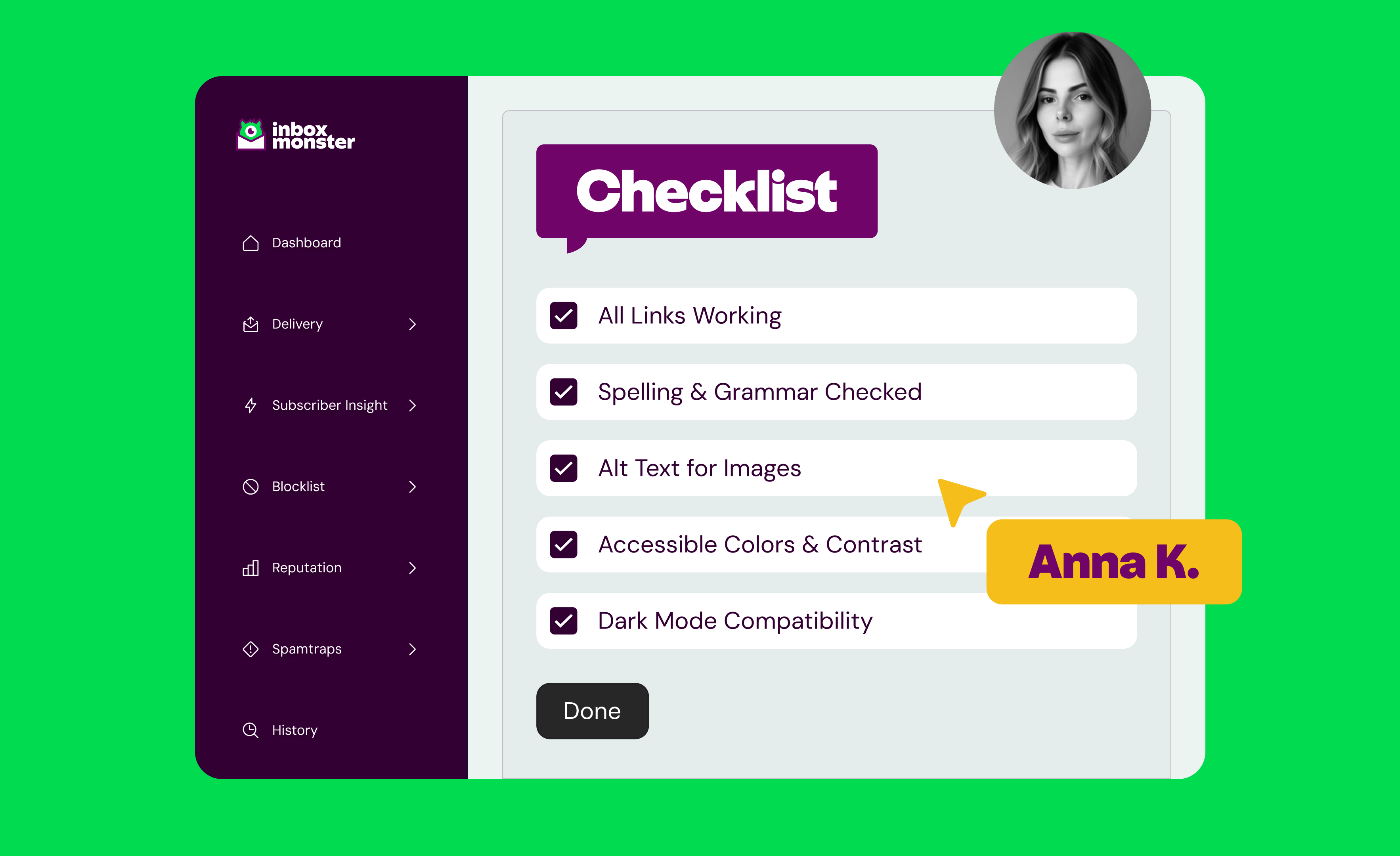
Accessibility checklist to ensure your email is EAA compliant
On June 28, 2025, the European Accessibility Act (EAA) officially came into force. In simple terms, it requires that digital services like websites, apps, e-commerce platforms—and email—must be accessible to people with disabilities in the EU.
Yes, even email.
Even if you (as the sender) are not in the EU, if you’re sending marketing or transactional emails to anyone in the EU, you need to make sure those emails are screen reader–friendly, keyboard-accessible, readable at a glance and clear in both content and design.
In this blog post, you’ll get a walkthrough of what it means to comply with the EAA, who needs to comply, and how to create accessible emails that will comply.
Let’s do this!
In this guide:
- Why Email Marketers and Deliverability Pros Need to Care About the EAA
- Accessibility Makes Your Email Better for Everyone
- EAA Email Requirements: What Marketers Must Do to Comply
- How to Make Your Emails Accessible: Workflow Tips for Every Team
- Inbox Monster’s Accessibility Checker: How It Helps You Stay Compliant
- How Accessibility Improves Deliverability and Email Performance
- EAA Enforcement Has Started: What Happens If You’re Not Compliant?
- More Accessibility Laws Are Coming. Here’s How to Prepare.
- Accessibility Isn’t an Obstacle. It’s a Competitive Advantage.
Why Email Marketers and Deliverability Pros Need to Care About the EAA
Whether you're writing subject lines, designing an email, QA'ing HTML or analyzing inbox placement, ensuring email accessibility is now your responsibility. The burden of ensuring accessibility of email is being squarely placed on the brands and senders.
Yep, even you.
While you might be thinking, this still doesn’t apply to you. Here are some numbers that will change your mind.
According to the World Health Organization (WHO) 1.3 billion people live with a disability. That’s 16% of the global population. Potentially, hundreds of millions of active email users. Many of whom are on your email list.
Failing to comply with the EAA doesn’t just risk penalties, you’re leaving money on the table by not effectively communicating with a large population.
“But we don’t have EU customers…” Are you sure?
Let’s say you’re a U.S.-based retailer or a SaaS company with mostly North American clients. If even one person on your list lives in the EU, you need to be compliant with the EAA.
If you’ve scoured your email list(s) and still haven’t found a single person who lives in the EU, here are three very good reasons why you need to adopt accessibility best practices.
1. Accessible emails perform better across all demographics
Emails built with accessibility in mind tend to have better visual hierarchy, stronger copy and layouts that adapt to different devices and user needs. When your message is easier to read, more people read it. That translates into higher engagement, more clicks and better conversions. And with better engagement, you’re signaling to inbox providers that your emails are worth being delivered to the inbox.
2. They reduce friction (and unsubscribes)
Friction is anything that slows down or frustrates the subscriber—unclear CTAs, low-contrast text or layouts that break on mobile devices. Accessible emails minimize that frustration.
3. They position your brand as thoughtful and forward-thinking
Prioritizing accessibility sends a clear message: you care about all of your customers. It signals inclusivity and respect, which builds trust over time. And let’s not forget—as accessibility becomes more regulated, being ahead of the curve shows leadership, not just compliance.
Accessibility Makes Your Email Better for Everyone
When we talk about accessibility, it's easy to picture accommodations designed only for people with permanent disabilities. But the truth is, accessible design benefits far more people than you might expect. It makes your emails more usable, more pleasant to engage with, and ultimately more effective.
Accessibility removes barriers for everyone who interacts with your emails under less-than-perfect conditions, too. Whether someone is reading your message in bright sunlight, on a cracked phone screen, with aging eyes, or just in a hurry, an accessible design makes their experience smoother.
Older adults benefit from larger text and better contrast
As we age, our vision naturally declines. Smaller text becomes harder to read, and poor color contrast can make content nearly invisible. Accessible emails that use minimum 16px font sizes and strong color contrast are a relief for a massive and growing portion of your audience.
Mobile users appreciate responsive, scannable content
According to AudiencePoint, it’s estimated that 50-60% of email opens come from a mobile device. That means people are interacting with your content on smaller screens, often with one hand, sometimes while multitasking. Emails that scale gracefully, break content into digestible sections, and keep call-to-action buttons finger- and thumb-friendly perform better for everyone—especially on mobile.
All readers benefit from clearly labeled links and uncluttered design
Vague calls to action like "click here" don’t just confuse screen reader users—they slow everyone down. Clear, descriptive link text helps readers make decisions faster. And clean layouts with proper hierarchy (headlines, subheads, body copy) help users scan and act quickly.
Accessibility isn’t about compromise, it’s about clarity. It amplifies your brand and message to a broader, more engaged audience.
The proof is in the pudding: a large American non-profit saw a 41% increase in donations when they prioritized text and typography considerations for accessibility.
Imagine what prioritizing accessibility could do for your email performance.
EAA Email Requirements: What Marketers Must Do to Comply
The EAA draws from the WCAG 2.1 AA standards. These guidelines aren’t just about checking boxes—they’re about creating experiences that more people can use.
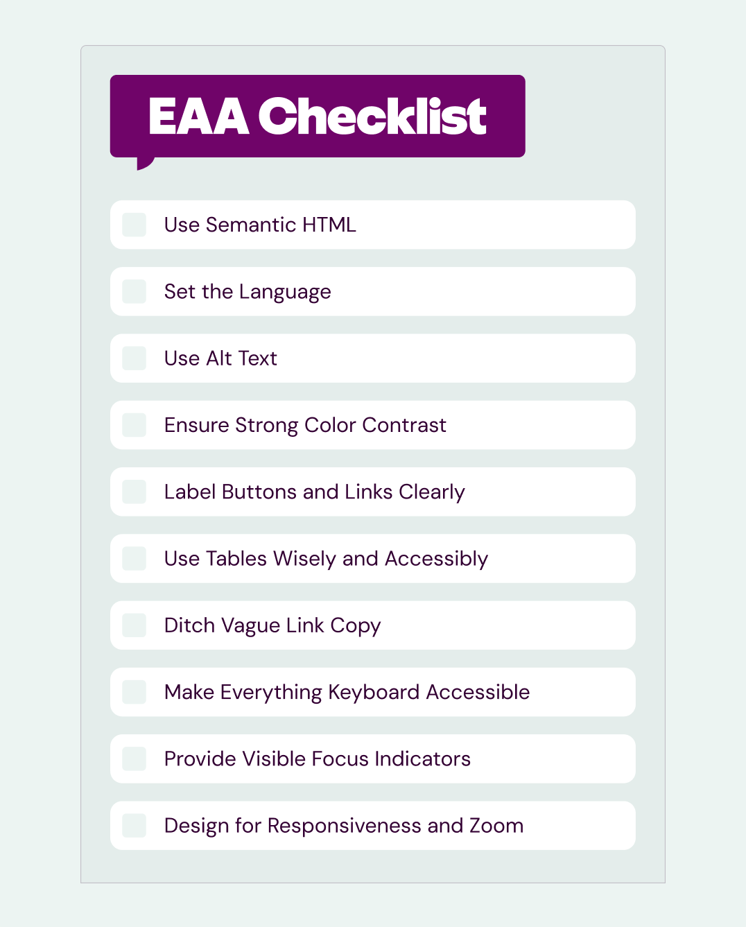
Use semantic HTML
Structure your emails with meaningful tags: headings (<h1> to <h6>), paragraphs (<p>), lists (<ul>, <li>), and tables with proper header labels. This creates a clear hierarchy for screen readers to follow, helping users understand your content even without visuals.
Set the language
Declare the language of your email with <html lang="en">. Screen readers use this to pronounce words correctly and switch dialects when needed.
Use alt text
Every image that conveys meaning must have descriptive alt text. A photo of a product? Describe it. A promo banner? Summarize the message—and ensure the alt text is contextually relevant. Decorative flourishes? Use alt="" to skip them.
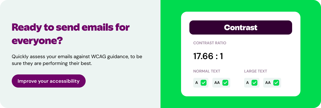
Ensure strong color contrast
The contrast ratio between text and background must be at least 4.5:1 for normal text, and 3:1 for large text (over 18px bold or 24px regular). Poor contrast affects everyone in bright light or on low-quality screens, not just users with visual impairments. Tools like WebAIM’s contrast checker will be your best friend here.
Label buttons and links clearly
All interactive elements should have visible, meaningful text. If you’re using icons or buttons without text, include an aria-label that describes the action (e.g., aria-label="Search").
Use tables wisely and accessibly
If you rely on tables for layout (a common email dev necessity—thanks Outlook!), be sure to use <th> tags for headers and scope attributes like scope="col" or scope="row" to help screen readers make sense of the structure.
Ditch vague link copy
Links like "click here" don’t make sense out of context, especially when read by a screen reader. Use specific, descriptive text like "Read the full study" or "Download the accessibility checklist."
Make everything keyboard accessible
Not everyone uses a mouse. Ensure all links and buttons can be accessed via the tab key. This is essential for users with motor impairments or screen reader users.
Provide visible focus indicators
When someone tabs through your email, there should be a visual cue (like a border or highlight) that shows which element is selected. This is essential for keyboard navigation.
Design for responsiveness and zoom
Your email should work well on mobile and allow users to zoom in up to 200% without breaking the layout. This helps users with low vision or those on small screens.
Get a downloadable checklist, so you never miss an accessibility best practice.
How to Make Your Emails Accessible: Workflow Tips for Every Team
You might be thinking, this sounds like extra work to make sure all of my emails are accessible. Good news: It doesn’t take a full overhaul. With some minor tweaks to your workflow, you’ll be able to easily ensure every single one of your emails complies with the European Accessibility Act.
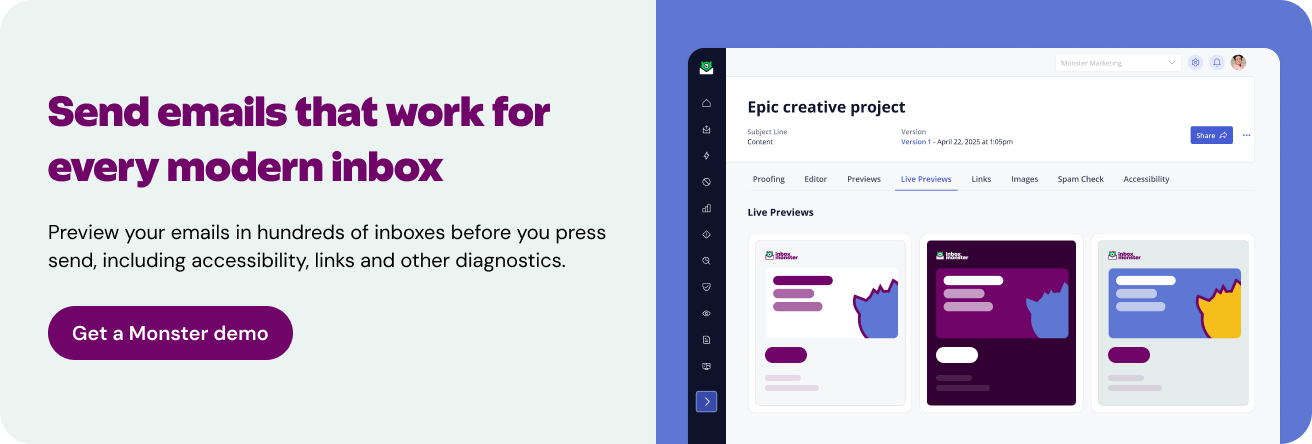
Start with email previews
Check how your email renders in major inboxes and on mobile devices.
Run an accessibility check
Use a tool like Inbox Monster to scan for issues like poor contrast, missing alt text and keyboard traps.
Educate your team
Whether you’re a strategist, copywriter, designer, or neck-deep in the technicalities of deliverability, everyone should understand the basics. Share this blog post with your team.
Use reusable, accessible templates
Creating modules and templates that meet WCAG standards is the best first step to ensure accessibility across all of your emails. Then, all you need to do is reuse them across campaigns. And just like that—accessible emails.
“Accessibility is an ongoing process. Keep testing regularly, train your teams, and treat this as a standard—not a one-off fix.” — Sam Gamble
Inbox Monster’s Accessibility Checker: How It Helps You Stay Compliant
Inbox Monster's Accessibility tool scans your email HTML and evaluates it against WCAG 2.1 AA and ADA standards.
Here's how it works:
Step-by-step walkthrough:
- Upload or import your HTML: Simply drag and drop or pull in your email code from your ESP.
- Navigate to the Accessibility tab: The checker analyzes your code instantly.
- Review issues by severity: Errors are flagged as Critical, Serious, or Moderate.
- See exactly what needs fixing with actionable insights, like:
- Missing alt text on logo image
- Low color contrast between CTA and background
- No visible focus style on button element
- Re-test on the fly: Make your fixes, re-run the scan, and track your improvements.
How Accessibility Improves Deliverability and Email Performance
Accessibility and deliverability aren’t two separate efforts. They’re closely linked, because the factors that make email more accessible are the same ones that drive better engagement. And better engagement is a key deliverability signal.
Here’s how accessibility helps you win on both fronts:
Performs better with recipients
Accessible emails are easier to read, skim and act on. When your audience can quickly understand your offer—whether they’re reading with a screen reader or scanning on a phone—they’re more likely to click. Clear content leads to higher engagement: more opens, more clicks, more time spent reading. Which are all positive signals to mailbox providers.
Generates fewer complaints
Confusing or unreadable emails frustrate people. And frustration drives negative behaviors: unsubscribes, spam complaints, and disengagement. Accessible emails reduce these risks by eliminating confusion and making key actions easy. Like finding the unsubscribe link or understanding the content.
Get rewarded with better inbox placement
Mailbox providers look at engagement signals like opens, clicks, deletions, and spam complaints to determine sender reputation. If your emails are clear, inclusive, and easy to interact with, those positive signals add up. The result? You’re more likely to reach the inbox, not the spam folder.
“Strong user feedback and engagement that mailbox providers love to see will just instill a stronger deliverability as a whole—it’s a win-win for everyone.” — Anna Kotlikov
EAA Enforcement Has Started: What Happens If You’re Not Compliant?
Now that the deadline has come and gone, companies are expected to prove compliance. That includes being ready for audits, showing documentation and, in some cases, halting non-compliant communications.
“If you’re not compliant, that comes with hefty fines and penalties—up to €1,000 per day—and in severe cases, an order to stop sending emails or halt business in that country.” — Anna Kotlikov
Ignoring accessibility requirements isn’t just a bad look—it’s a business risk. The EAA comes with real consequences for non-compliance, and enforcement isn’t theoretical anymore. Regulators across EU countries now have the authority (and increasingly, the motivation) to take action against organizations that don’t comply.
Failing to meet these standards can put your brand in legal, financial, and reputational hot water. And the damage isn't limited to companies based in the EU. If you’re emailing EU citizens, you’re fair game.
Here’s what you could be facing:
Fines of up to €1,000/day
That’s not a typo. Regulators can issue daily fines for each day your emails remain non-compliant. These penalties add up quickly and can drain budgets that would be better spent improving your email program.
Audits and documentation requests
Authorities in each EU country may request documentation proving that your team has considered accessibility. If you can't show testing logs, alt text policies or code samples, you're in trouble.
Complaints. Sometimes from your competitors.
Complaints don’t have to come from customers. A user with a disability, a concerned family member or even a rival brand can file an official complaint that kicks off an investigation.
Takedown orders or restrictions
In extreme cases, companies may be ordered to stop sending email into the EU until they can prove compliance. That’s lost revenue, broken customer trust and a long road to reinstatement.
Reputational damage and performance loss
Accessibility isn't just about compliance, it’s also about perception. Non-accessible emails can frustrate users, damage trust and drive disengagement. That leads to higher unsubscribe rates, weaker sender reputation and inbox placement issues.
Take these steps to stay ahead:
- Audit your current email templates and workflows
- Implement a testing process with accessibility checks baked in
- Use tools like Inbox Monster’s Accessibility Checker to catch issues before you press send
- Create documentation to show due diligence and ongoing improvements
More Accessibility Laws Are Coming. Here’s How to Prepare.
“I feel like there will be more regulations globally in the future, similar to the EU.” — Anna Kotlikov
The EAA is just the beginning. As digital regulation continues to evolve, it’s likely that other countries, as well as global platforms, will follow suit with their own accessibility requirements. You might be surprised to learn, many already are.
Canada’s AODA (Accessibility for Ontarians with Disabilities Act) and updated guidance from the U.S. Department of Justice under the ADA point to tighter standards ahead. Big tech platforms, financial institutions, and ecommerce companies are already adopting WCAG-based design as a baseline. Accessibility is shifting from a “nice to have” to a default expectation.
So how can you prepare for what’s next?
Expect more legislation
The EU has paved the way, but other regions are following. The laws might vary in scope, but WCAG 2.1 AA is increasingly the common denominator. If you’re already working toward that benchmark, you’re well-positioned for future compliance.
Future-proof your strategy
Stop treating accessibility as a last-minute fix. Build it into your design and QA process from the start. Reusable, accessible email blocks and a consistent checklist will make scaling up simpler later.
Stay informed
Monitor updates from organizations like W3C, WebAIM, and your country’s regulatory body. Subscribe to industry newsletters and stay in close touch with your ESP or agency to track platform-level changes. Follow email accessibility advocates like Sarah Gallardo, Lauren Castady, Alice Li, and Anne Tomlin to help you stay informed.
Use the right tools
Invest in tools that make accessibility checks part of your everyday workflow—not an extra step. Inbox Monster’s accessibility tool is built to slot into the QA process, flagging issues before you press send.
Accessibility Isn’t an Obstacle. It’s a Competitive Advantage.
Too often, accessibility is framed as a compliance burden or a technical limitation. But in reality, it’s a design principle—a mindset—that leads to better communication for everyone.
When you make your emails accessible, you make them more human. You prioritize clarity over cleverness. You reduce confusion. You respect your audience’s time, attention, and needs. And you show that your brand doesn’t just care about aesthetics or metrics, it cares about people.
Accessibility isn’t just about doing the right thing (although it absolutely is). It’s also a growth opportunity. It opens up your emails to more readers, more markets, and more engagement. It aligns your team around shared values. It forces thoughtful design, purposeful messaging, and technical rigor.
And in a world where inboxes are overflowing, that’s not a limitation. It’s a competitive edge.
So don’t wait for a fine to take accessibility seriously. Start now, improve over time, and build a program that’s more resilient, more inclusive, and more effective for everyone.
European Accessibility Act FAQ
What does EAA stand for?
EAA stands for the European Accessibility Act. It’s a law that aims to enhance the inclusivity of products and services for people with disabilities.
Do I have to comply if I’m not based in the EU?
Yes. If your emails land in an inbox that’s in the EU, you need to comply with the EAA.
What’s the difference between WCAG and EAA?
EAA is the law; WCAG 2.1 AA is the standard it references.
Are transactional emails included?
Yes, all emails count: Transactional, promotional, newsletters—all emails are required to comply with the EAA.
What can I do to make sure my emails are compliant?
Inbox Monster’s Accessibility Checker is a great place to start. Use the Accessibility Checker to understand how accessible your emails are now and what you need to change to make them more accessible.
What’s the first thing I should fix?
Font size, contrast, alt text, and semantic structure are the easiest elements to start with.
How do screen readers interpret email?
They rely on semantic HTML and structural clarity to read content aloud in logical order.
Can I still use animated GIFs and be accessible?
Yes—just avoid animated GIFs that flash more than three times per second and provide descriptive alt text.
Will creating accessible emails make my emails look boring?
You can still have beautiful design, bold branding and fun visuals. The difference is you're building them with intention.
Do accessibility concerns only impact people with permanent disabilities?
Accessibility benefits everyone: older adults, temporary impairments, mobile users, neurodivergent readers.
Will our email service provider (ESP) ensure our emails are compliant?
Most likely, no. You are responsible for how accessible the emails you send are. Your team still needs to write alt text, code semantically, and structure your email for clarity.

