Regardless of what everyone’s marketing predictions will be, the inbox keeps changing. Filters get smarter, privacy settings get tighter and what counts as “good engagement” keeps evolving. That means the metrics that mattered five years ago might not tell the whole story anymore.
To understand how well your email program is performing, you need to look beyond surface numbers like opens and clicks. Tracking more data isn’t as important as tracking the right data—metrics that reflect how mailbox providers view your reputation and how people engage with your content.
This guide breaks down the nine email metrics every marketer should know: five you should already be measuring, and four more future-forward metrics that will shape how you track performance in 2026 and beyond.
Here’s the TL;DR
If you’re still tracking only opens and clicks, it’s time to evolve. The metrics that matter in 2026 blend deliverability, engagement and trust. The smartest teams use them to connect inbox visibility to real business impact, elevating the true power of email marketing.
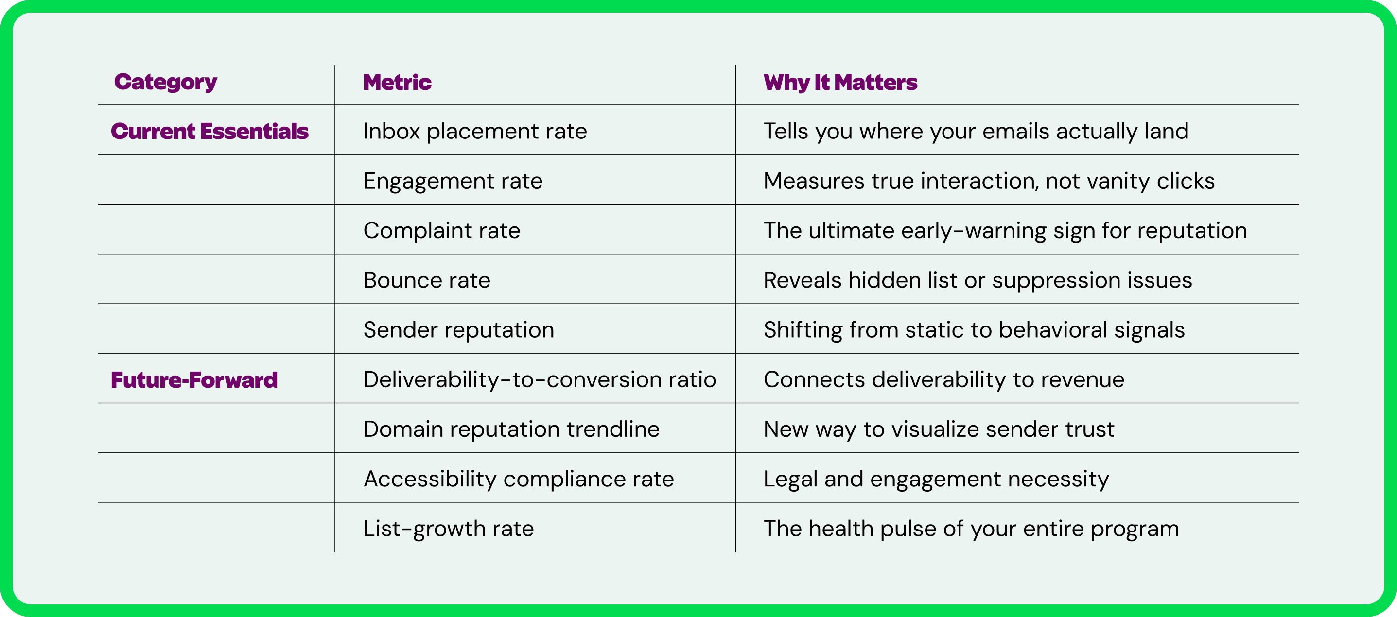
The 5 Email Metrics You Should Already Be Tracking
The fundamentals will always matter, but the way you interpret them is changing fast.
This first set of metrics is the foundation of every strong email program. They’re the ones you should already be tracking and optimizing. But even the basics evolve. Deliverability, engagement and reputation aren’t static.
Instead of treating these metrics like a checklist, think of them as a living system. Each one affects the others, and together, they tell you whether your email ecosystem is healthy or in need of a tune-up.
1. Inbox Placement Rate
This is the North Star of deliverability indicators. Delivery rate (emails sent minus bounces) just tells you that messages were accepted by the mailbox provider. The inbox placement rate tells you whether they were actually seen.
A strong inbox placement rate means your authentication, reputation and content quality are working together in harmony.
- Definition: The percentage of your emails that reach the inbox instead of spam or junk folders.
- Why it matters: Even small dips can have a huge impact on performance. For example, a drop from 98% to 90% inbox placement could mean thousands of lost impressions.
- How to calculate it: Delivered to inbox ÷ Total delivered emails × 100
- End-of-year to-do: Compare inbox placement by domain and segment. Your Gmail performance may look very different from Outlook or Yahoo.
2. Engagement Rate (Click-to-Open vs. CTR)
Clicks tell you who was curious. Engagement rate tells you who was interested. Looking at both the click-to-open rate (CTOR) and the click-through rate (CTR) helps you understand how well your content resonates once someone has actually opened the email.
- Definition: The percentage of subscribers who clicked on your content, measured either as clicks ÷ opens (CTOR) or clicks ÷ delivered (CTR).
- Why it matters: ISPs look at engagement as a key deliverability signal. High engagement keeps you in the inbox; low engagement can push you toward the junk folder.
- Average engagement rate: Approximately 3-11% CTOR and 2% CTR, depending on your industry.
- How to calculate it: CTOR = Clicks ÷ Opens × 100. CTR = Clicks ÷ Delivered × 100.
- End-of-year to-do: Track your engagement rate over time to see trends throughout the year to see if there’s any seasonality to your email program performance.
3. Complaint Rate
Complaints are one of the earliest signs of deliverability trouble and a signal to ISPs that something isn’t landing well with your audience.
- Definition: The percentage of people who mark your message as spam or junk.
- Why it matters: Complaints directly damage your sender reputation, which affects inbox placement. Too many and you’ll find your emails quietly rerouted to spam. However, it’s worth noting that a low complaint rate can be misleading, as it only reports on emails that reach the inbox. That’s why it’s important to track multiple email signals and data sources for the full picture of performance.
- Acceptable threshold: 0.3% (to meet Google and Yahoo’s sender requirements)
- How to calculate it: Complaints ÷ Delivered × 100
- End-of-year to-do: Identify which emails or campaigns drive complaints (Google Postmaster Tools Feedback Loop Identifiers can help with this.) Then audit content, frequency and targeting to help you uncover the “why.”
4. Bounce Rate (and Why “Low” Isn’t Always “Good”)
Bounces happen, but understanding why they happen is what matters. A bounce rate that’s too high can signal poor list hygiene, but one that’s suspiciously low can hide problems your email service provider (ESP) is masking.
- Definition: The percentage of emails that couldn’t be delivered. There are two types: hard bounces (permanent issues like invalid addresses) and soft bounces (temporary problems like full inboxes or server timeouts)
- Why it matters: Bounces affect both list quality and sender reputation. Hard bounces need removal; soft bounces need monitoring.
- Acceptable bounce rate: Below 2% is considered healthy (Source: ZeroBounce)
- How to calculate it: Bounced emails ÷ Sent emails × 100
- End-of-year to-do: Track bounce rate trends over time. A steady climb means you need to review your email address acquisition methods and consider implementing a re-engagement program.
5. Sender Reputation (and the Future of Reputation Reporting)
Reputation used to be easy to measure. Gmail Postmaster Tools and Microsoft SNDS give clear IP and domain tiers—until the day they decide not to. Now, reputation is dynamic, and your metrics need to reflect that.
- Definition: A measure of how trustworthy your sending behavior appears to mailbox providers, once tracked through tiers with traffic light colors and bad/low/medium/high rankings.
- Why it matters: Gmail decided to postpone the deprecation of domain and IP reputation data—for now. Marketers should prepare to infer reputation health from behavioral indicators like engagement, inbox placement and complaint trends.
- How to calculate it: There’s no single formula. Monitor related signals (inbox placement, complaints, engagement trendlines).
- End-of-year to-do: Focus on trends over time. If engagement dips as complaints rise, your reputation needs attention.
The 4 Metrics That Will Matter Most in 2026
These next metrics go beyond opens and clicks to uncover how your audience interacts with your brand over time. As inboxes get smarter and privacy standards tighten, success will depend on understanding why people engage, not just whether they do.
If you want your program to thrive in 2026 and beyond, this is where to start paying attention.
6. Deliverability-to-Conversion Ratio
Monitoring your deliverability doesn’t matter unless it drives action. This metric directly links inbox visibility to business impact, showing how many conversions came from emails that reached the inbox.
- Definition: The ratio of conversions to inbox-delivered emails.
- Why it matters: It reveals how inbox placement influences revenue and helps make a business case for deliverability investment.
- How to calculate it: Conversions ÷ Inbox-delivered emails × 100
- End-of-year to-do: Use this ratio to prove ROI when presenting results to leadership. It translates technical deliverability gains into bottom-line language.
7. Domain Reputation Trendline (The New Way to Measure Trust)
With Gmail’s static reputation data at risk of eventual deprecation, trendlines are the new trust metric. Watching changes over time paints a more accurate picture of sender health than a one-time score ever could.
- Definition: A visualization of your domain’s trust and reputation over time, based on inbox placement, engagement and complaint data.
- Why it matters: Spotting gradual declines or spikes helps identify issues early, before they impact inbox placement.
- How to calculate it: Aggregate inbox placement, engagement and complaint data by week or month to visualize shifts.
- End-of-year to-do: Replace “score snapshots” with rolling reports. Continuous monitoring is the only way to stay ahead of mailbox algorithms.
8. Accessibility Compliance Rate
It’s reported that up to 28% of your audience relies on accessible communications. That’s a significant portion of people to be excluding from your email marketing. And as recent regulations take effect, accessibility becomes a mission-critical component of email QA.
- Definition: The percentage of campaigns that meet accessibility standards (contrast, semantics, alt text, structure, etc.).
- Why it matters: The European Accessibility Act (June 2025) makes compliance a legal requirement for many businesses. Accessibility also boosts engagement for all audiences, ensuring that everyone can effectively engage with your messages.
- How to calculate it: Compliant campaigns ÷ Total campaigns × 100
- End-of-year to-do: Run accessibility audits using Inbox Monster’s accessibility checker to identify missing alt text, poor contrast or semantic errors.
9. List-Growth Rate (and What It Says About Program Health)
Your list is the heartbeat of your email program. Tracking growth rate helps you understand whether your acquisition and retention strategies are working.
- Definition: The rate at which your subscriber list grows compared to unsubscribes, bounces and suppressions.
- Why it matters: Healthy growth reflects good acquisition sources and audience trust. Inflated lists often hide unverified or unengaged contacts.
- How to calculate it: (Net new subscribers – Unsubscribes) ÷ Total subscribers × 100
- End-of-year to-do: Compare net new subscribers vs total unsubscribes per quarter to measure list health over time. Just be aware that recent industry shifts, like Gmail’s launch of its Manage Subscriptions feature, may have resulted in unsubscribe spikes during Q3 of this year.
How to Use These Metrics in Your Year-End and Quarterly Reporting
Your year-end report should ideally tell a story about your email program’s health and opportunities for improvement.
Here’s how to make it actionable and presentation-ready.
1. Start With Benchmarking
Before you tell any story, you need a baseline. Pull your average results from the previous 12 months for each key metric: inbox placement, engagement rate, complaints, bounces and list growth.
- Collect data by quarter so you can show change over time instead of single-campaign snapshots.
- Use a consistent data source (e.g., your ESP or Inbox Monster dashboard) to avoid gaps or double-counting.
- Where possible, compare your program against industry benchmarks to show how it performs in context.
2. Build Your Own “Email Performance Scorecard”
A scorecard turns your metrics into a simple, visual summary anyone can understand. Include three sections that roll up into an overall program health score:
- Deliverability: inbox placement rate, bounce rate, sender reputation trendline
- Engagement: click-to-open rate, accessibility compliance
- Trust and Growth: complaint rate, list-growth rate, deliverability-to-conversion ratio
For each category, assign a color or status:
- ✅ Healthy: performing above target or benchmark
- ⚠️ Needs attention: trending down but not critical
- 🔴 Critical: below threshold or showing decline over multiple quarters
Use bar or line charts to visualize trends and make wins obvious at a glance.
3. Tell the Story Behind the Data
Numbers by themselves don’t persuade anybody. You need to translate data into insights your stakeholders care about:
- Show patterns, not points: “Inbox placement dropped in Q3 after frequency increased” is far more meaningful than “Placement is 93%.”
- Connect cause and effect: Tie metrics to business actions (“After implementing authentication updates, complaint rates dropped 0.2%”).
- Highlight cross-metric relationships: For example, a rise in engagement may correlate with an increase in list growth due to improved onboarding.
- Summarize key learnings: End each section with one sentence that starts with, “This tells us…” Example: “This tells us our improved segmentation strategy stabilized inbox placement across Gmail and Outlook.”
4. Present It for Impact (and Elevate Your Work)
When presenting to leadership or peers:
- Lead with trends. Start with progress since the last report, not current numbers.
- Visuals over text. Use line charts for trends and pie charts for composition.
- Keep commentary tight. Use one sentence to interpret each graph.
- End with action steps. Three clear next moves (e.g., clean suppressed lists, expand re-engagement, test accessibility).
If you’re sharing the report deck:
- Begin with a “Highlights” slide that summarizes the top improvements and red flags.
- Follow with metric-specific visuals grouped under Deliverability, Engagement, and Trust.
- Close with a “What We’ll Do Next” section. This turns metrics into a roadmap, not a report card.
5. Make It Repeatable
Create a reporting template that your team can update quarterly. That way, trends are easy to spot, and leadership gets used to seeing progress in a consistent format.
Here’s an example of how you could structure the template:
- Overview summary (one paragraph)
- Three-part scorecard (Deliverability / Engagement / Trust)
- Key insights and next steps (three bullet points per quarter)
This cadence builds credibility. When you walk into Q1 planning with clear, consistent reporting, you’re showing that your email program is measurable and ready for what’s next.
Use Inbox Monster to Help You Track What Actually Matters
Inbox Monster makes tracking these metrics simpler by bringing together deliverability, engagement and reputation data under one roof:
- Deliverability monitoring: Seed testing, inbox placement tracking and blocklist alerts show where your emails land.
- Domain trust insights: Track reputation trendlines across Gmail, Yahoo, Microsoft and more.
- Accessibility checker: Ensure your emails meet compliance standards.
Together, they help you see the why behind performance shifts, not just the what.
Measure Smarter for Stronger Connections
Email metrics are the story your audience is trying to tell you. Every open, click, complaint or bounce is feedback about what’s working and what’s not.
Great marketers use metrics to guide decisions, to earn trust and to keep improving with every send.
Keep tracking. Keep refining. Keep learning what your numbers are trying to tell you, and use that knowledge to build stronger connections that actually last.
{{closer-look="/blog-ctas"}}
Email Marketing Metrics FAQ
What’s the difference between deliverability and inbox placement rate?
Deliverability measures whether your email was accepted by the server. Inbox placement rate measures whether it landed in the inbox. For instance, you can have 100% deliverability, but only 80% inbox placement if messages get caught in spam.
How often should I benchmark my email marketing metrics?
Quarterly is ideal for most programs. But if you’re sending high volumes or managing multiple brands, monitor deliverability and complaints weekly to catch issues before they snowball into crises.
Should I still measure open rates?
Yes, but as a directional metric, not a core KPI. With Apple’s Mail Privacy Protection, Gmail’s image caching and other privacy filters, open rate data is inflated. Use it to spot trends, rather than make critical business decisions.
What’s a good unsubscribe rate?
Generally under 0.5% per send, though this varies by industry. You should aim to maintain a steady unsubscribe rate—it means your list is self-cleaning and engaged.