Dark Mode isn’t just a trendy design choice, it’s how millions of people read their email every single day. Apple Mail, Gmail, Outlook, and countless mobile apps now offer Dark Mode by default. For your subscribers, it’s easier on the eyes and saves battery life. For you, the marketer, it can turn a perfectly polished email into a hot mess if you don’t test it.
Logos disappear. Buttons lose contrast. Text fades into the background like an invisible ink trick. It’s not pretty. And it’s not optional to ignore.
Most email marketers aren’t designers or coders. But that doesn’t mean you’re powerless. You don’t need Photoshop skills or an HTML crash course. What you do need is a monster-sized cheat sheet: how to spot Dark Mode issues, how to talk about them clearly and how to make sure your team knows what to fix.
This is that guide.
Here’s the TL;DR
Dark Mode isn’t a design trend, it’s how millions of subscribers read your emails—and it can wreck your carefully planned design if you don’t test.
This guide shows you how to:
- Spot common issues (white-box logos, disappearing text, muddy colors, ghost buttons)
- Run quick QA without coding and explain fixes to your team.
The bonus? Cleaner design improves accessibility and engagement, which protects deliverability, too.
Why Dark Mode Breaks Emails (and Why QA Matters)
Dark Mode is not one standard, it’s dozens. Unfortunately.
Apple Mail, Gmail and Outlook each have their own way of handling Dark Mode. Some invert colors, some darken backgrounds, some only tweak text and some just partially invert colors. And to make it more fun, the same client might behave differently on desktop and mobile.
Don’t panic! We found a shortlist of what typically goes wrong:
- The white box problem. Non-transparent images, like a JPEG logo, suddenly look like they’re pasted on a white sticker.
- Invisible text. Dark gray body copy that looks fine in Light Mode can melt into a black background.
- Muddy brand colors. Bold red or blue gets automatically tinted, looking dull and off-brand.
- Vanishing icons. Social media logos or small graphics may fade into the background.
- Low-contrast buttons. Call-to-action buttons (CTAs) lose their punch if the background and text don’t stand out.
And here’s why it matters: trust erodes fast when an email looks sloppy. If subscribers can’t read the copy or find the CTA, they’re less likely to click. Or open your next campaign at all.
Why Dark Mode Matters (Beyond Design)
Here’s where your Dark Mode savvy becomes strategic gold for the team and not just a “nice to have.” By paying attention to Dark Mode, you're championing accessibility and helping future-proof deliverability. That's seriously good mojo.
1. Accessibility: Making Emails Inclusive for Everyone
Dark Mode isn't a trend. It helps people read. Globally, at least 2.2 billion people experience vision impairment, a number climbing fast as populations age. In the U.S. alone, millions live with uncorrectable vision impairment and many struggle with glare or low contrast.
Digging deeper: a WebAIM survey revealed 61% of people with vision disabilities report light or glare sensitivity, and nearly half have trouble with contrast. Additionally, the Email Markup Consortium reported 99.89% of HTML emails tested contain accessibility issues categorized as “Serious” or “Critical”, in a recent accessibility report indicating that there are still challenges to be met for email marketers.
Dark Mode can dramatically boost readability for a huge swath of your audience. But if your email breaks in Dark Mode—fading text, invisible buttons, white-block logos—you risk excluding people who rely on these accessibility features.
{{eaa-lowdown="/blog-ctas"}}
2. Deliverability: Engagement Protects the Inbox
Clean, accessible emails don’t just look better, they perform better, and that translates into better deliverability. Why? Because inbox service providers (ISPs) (Gmail, Yahoo, Outlook, etc.) monitor engagement signals. If subscribers open, click and interact, your sender reputation stays strong. But if your emails go unread due to poor design? They may end up drifting towards the spam folder.
How This Helps When You Talk to Colleagues
Think of these as your handrails when you're advocating for Dark Mode QA:
- Accessibility: You’re not just making things pretty, you’re making your emails readable to billions, including those with light or contrast sensitivity.
- Deliverability: When your email is clean and engaging in all modes, you’re protecting your inbox placement and your long game with subscribers.
With these facts, you’re not raising objections, you’re flexing strategic impact.
Your Dark Mode QA Workflow (No Coding Required)
The good news: you don’t need to know how to code to QA test Dark Mode. Think of yourself as the proofreader of the inbox. You’re not fixing issues, you’re catching them before your subscribers do.
Here’s a workflow you can run every time.
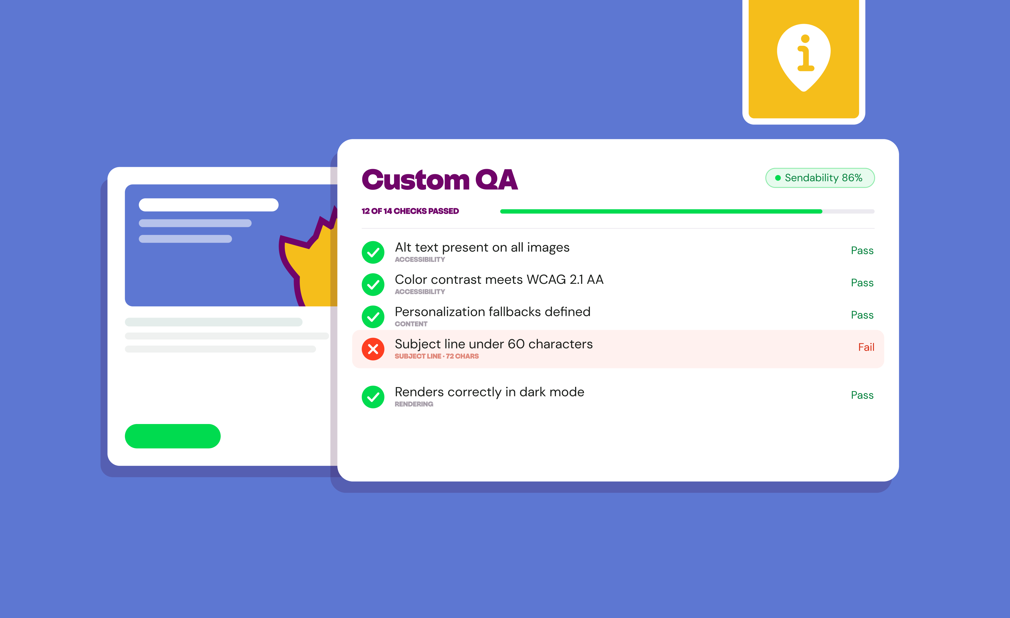
Step 1: Run a Rendering Test
Start with a rendering tool like Inbox Monster’s Creative Rendering. This shows you exactly how your email looks across dozens of clients and devices—including Dark Mode.
Which email clients to check:
- Apple Mail. Known for aggressive Dark Mode changes.
- Gmail (web + app). Popular across desktop and mobile.
- Outlook (desktop + mobile). A wildcard with its own quirks.
- Yahoo + others. If they’re a chunk of your audience.
Without rendering, you’re flying blind. What looks perfect in your email service provider (ESP) preview might implode in a subscriber’s inbox.
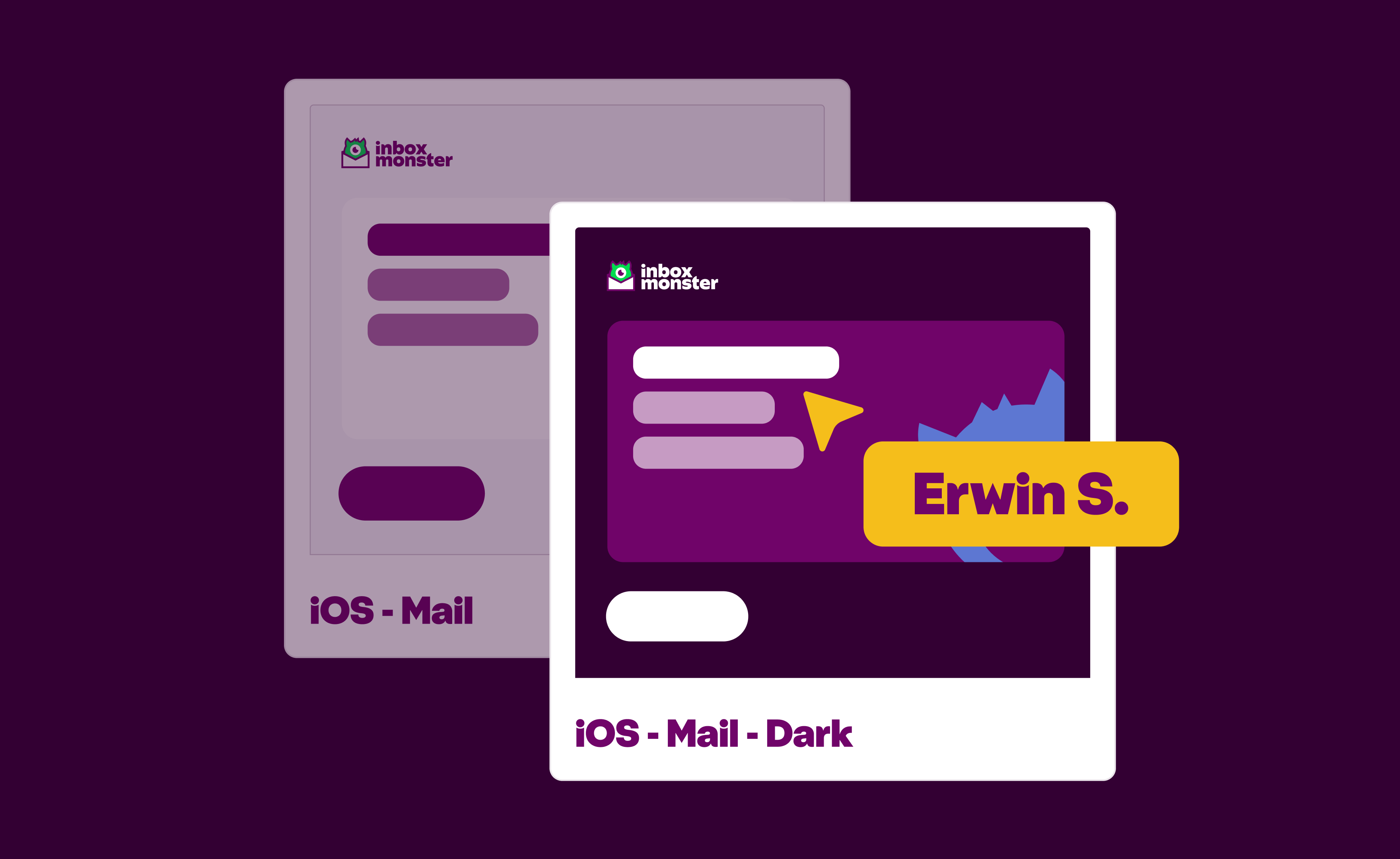
Step 2: Do a Visual Scan
Now it’s time to play spot-the-difference. Pull up your Light Mode and Dark Mode renders side by side. Scan for:
- Logos or icons surrounded by white boxes
- Text that disappears or gets hard to read
- Brand colors that look dull, grayish, or off
- Social icons that blend into the background
- Buttons that don’t look clickable
Do this check for both desktop and mobile. Dark Mode behavior can differ dramatically between the two.
Step 3: Flag & Communicate Issues Clearly
When you find a problem, your job is to document it clearly, not to fix it. Developers and designers will take it from there.
Here’s how you can help developers and designers see what you see to fix the problem:
- 📸 Take a screenshot and circle the problem area.
- 📝 Write a plain-language description: “CTA button disappears in Gmail Dark Mode on iOS.”
- 🔬 Add the context: client + device.
- 🛑 Stop there. Don’t dig into the HTML or suggest code tweaks.
Make it even easier on yourself and your team with comments on renderings, in Inbox Monster, to draw attention to and pinpoint issues. These comments roll up into the Proofing Tab, so you won't miss anything.
Dark Mode Cheat Sheet: Common Issues & Fixes
Here’s the part you’ll want to keep handy. This cheat sheet shows the five most common Dark Mode issues, why they happen and how to describe them to your team.
{{cheat-sheet="/blog-ctas"}}
Now, let’s take a deeper look at some of these common Dark Mode issues and their fixes.
“White boxes” around logos or buttons
This one shows up all the time, which means you’ll look like a hero for flagging it early. It happens because JPEGs (and some PNGs) carry a background color. Transparent PNGs or SVGs fix it. Or consider adding an outline to your logo if it’s a darker color.
Text disappearing or hard to read
This is often copy set in dark gray instead of black. Clients invert it, and poof—it blends into black backgrounds. Declaring text colors in the code solves it.
Muddy brand colors
If your primary brand color is a vivid red or blue, prepare for disappointment. Some clients desaturate bold colors in Dark Mode. Solution: add a secondary palette or work with design to define Dark Mode-specific color rules.
Vanishing icons
Tiny graphics like social icons often look fine in Light Mode but fade in Dark Mode. Best practice: maintain two sets of icons (light + dark) and swap them dynamically.
Low-contrast buttons
If the background isn’t explicitly defined, the email client may auto-adjust it in Dark Mode. Fix: set explicit background and text colors that meet accessibility contrast ratios.
You don’t need to be fluent in HTML or CSS to help your team. You just need to understand what you’re seeing it and how to clearly communicate it.
Quick Checks You Can Run Every Time
Before you hit send, run through this five-point sanity checklist.
- Logos: Are they transparent PNGs or SVGs? (No white boxes.)
- Text: Is it visible in both modes? (No disappearing copy.)
- Buttons: Do they have clear contrast? (No ghost buttons.)
- Icons: Are social logos visible in both modes?
- Backgrounds: No random white blocks or mismatched sections?
It’ll take you minutes to run through this quick checklist.
Dark Mode QA isn’t just for designers
If more than half of your audience is reading your emails in Dark Mode, ignoring it is like ignoring mobile optimization. As the email marketer, you don’t need to fix code. But you do need to:
- Run renders in Dark Mode.
- Scan for visual issues.
- Flag and describe them clearly.
That’s it. With this process, you can feel confident hitting “send” and confident your emails will shine in any mode.
{{creative-rendering="/blog-ctas"}}
FAQ: Dark Mode QA for Marketers
Do I need design skills to QA test Dark Mode?
Nope. You just need to be able to compare Light Mode and Dark Mode versions and spot where something looks off.
What’s the #1 mistake marketers make?
Ignoring logos. White boxes around logos are the most common and most avoidable issue.
Do I need to test every client?
No, just the ones your audience actually uses. Start with Gmail, Outlook, and Apple Mail.
How often should I run Dark Mode tests?
Every campaign. Rendering changes constantly—don’t assume one “clean” test covers all future sends.
Does fixing Dark Mode issues improve deliverability?
Indirectly, yes. Clean design improves engagement (opens, clicks). Poor engagement can impact inbox placement over time.