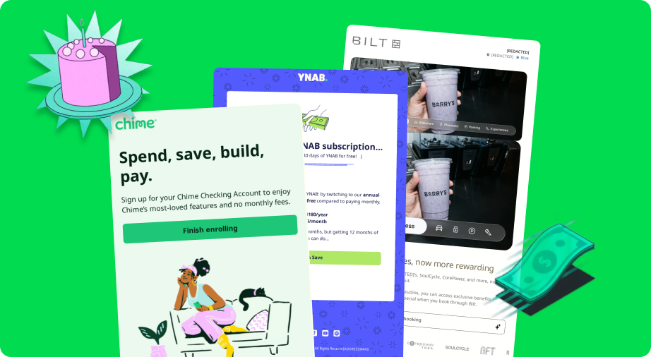
Using elements like animation, background images and interactivity can help emails to grab attention in crowded inboxes, build brand personality and create mini experiences that keep subscribers scrolling. A subtle animated GIF can guide the eye. A background image can set mood and depth. A bit of interactivity can turn a static message into something worth exploring.
But when those design flourishes break, the subscribers can go from “wow” to complete confusion in seconds. But testing complex email creative can feel like herding cats with a blindfold on. To the point where marketers often ask if it’s worth investing the time and effort to create these inbox experiences in the first place.
It’s worth it. One brand saw an 80% lift in clicks when it used interactive content to share personalized product recommendations.
In this post, we’ll share the pitfalls you need to watch out for when upping the creativity levels in your emails and how the right email testing workflow can save your sanity.
Here’s the TL;DR
Complex email designs don’t have to mean complex headaches. Here’s how to keep your sanity while testing:
- Different inboxes, different rules. Email clients treat animated GIFs, backgrounds and interactivity differently—so real inbox testing is non-negotiable.
- Animated GIFs need guardrails. Keep them light, readable and tested frame-by-frame. The first frame should always tell the story if animation fails.
- Backgrounds need backups. Combine code fallbacks and color layers to avoid blank boxes in Outlook or mobile clients.
- Interactivity needs insurance. Always plan static fallbacks and verify they render cleanly (and still track clicks).
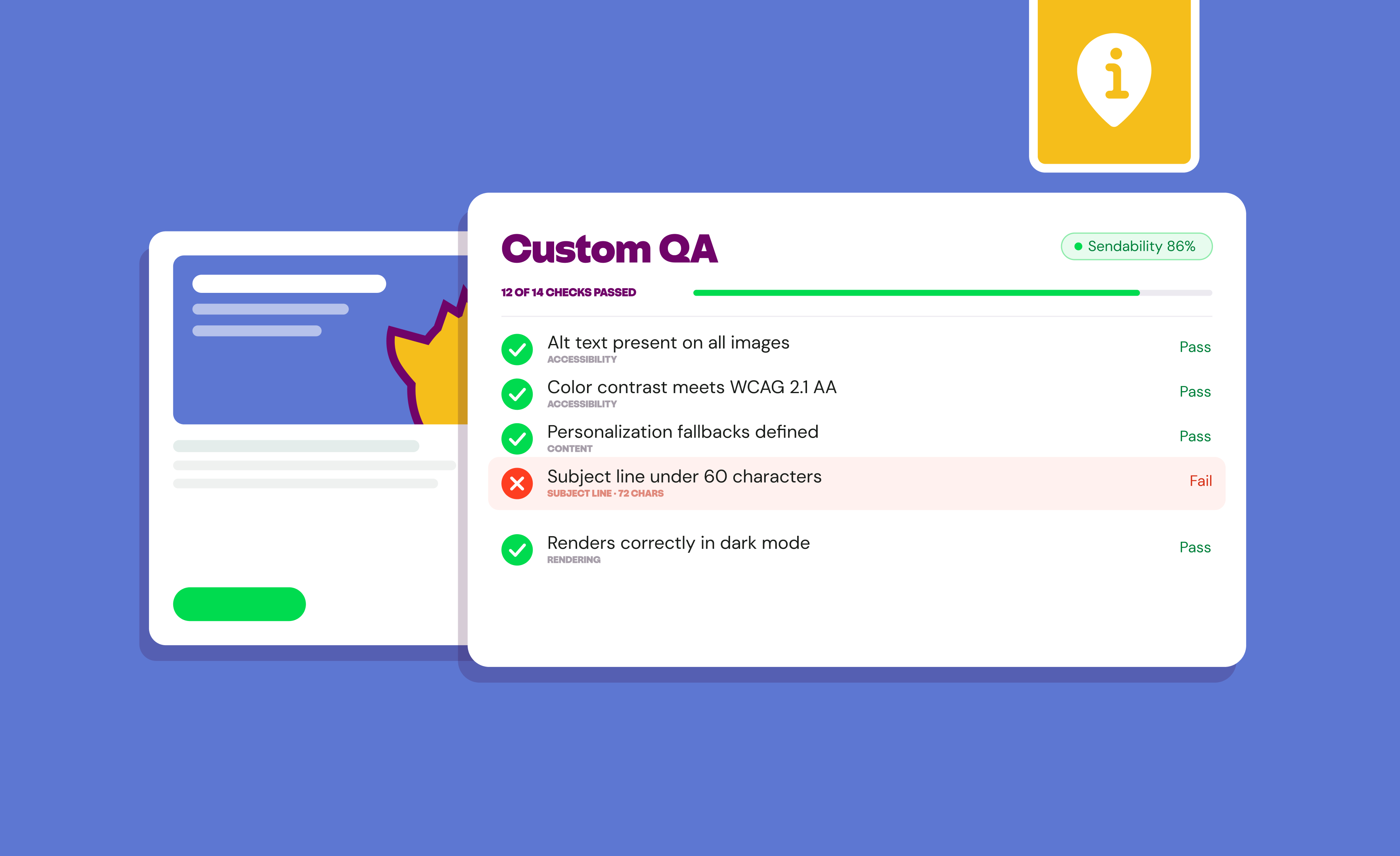
Inbox Monster does the heavy lifting with its Creative Suite. Preview animations and even interactive content across popular email clients so you can build with confidence.
{{closer-look="/blog-ctas"}}
Why Complex Creative Testing Feels Like Herding Cats
If designing a static email is like painting on canvas, designing with motion or interactivity is like painting on water. You might have it perfect in your email service provider (ESP) preview, but once it hits inboxes? Gmail compresses your GIF. Outlook forgets your background. Yahoo nails your animation but breaks the buttons.
There are countless email client and device combinations out there, and each interprets HTML, CSS and animation differently. Even your ESP’s built-in preview can tell a white lie. It shows you what’s happening in your browser when you preview an email versus what’s happening in an inbox.
Testing Animated GIFs and Why It’s Tricky

Animated GIFs are one of the simplest forms of creating motion in your email design. They’re lightweight, universally supported and instantly draw the eye. A single looping animation can tell a story faster than a paragraph of copy. Especially for your subscribers who are more inclined to scan your email rather than read every single word.
Animated GIFs are the perfect vehicle to:
1. Show off a product or transformation
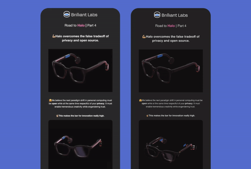
While buying online is the norm, customers can benefit from having a better feel for the product. In this example from Brilliant Labs, they share a mini breakdown of the components of their product to highlight its quality.
2. Evoke a feeling or emotion
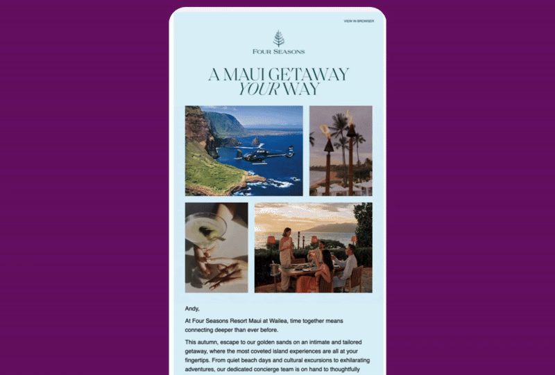
Sometimes static images can’t convey the same feeling or emotion that movement can. The animated GIFs in this email from Four Seasons makes you feel like you’re actually in Maui with the breeze flowing through your hair.
3. Showcase more with less
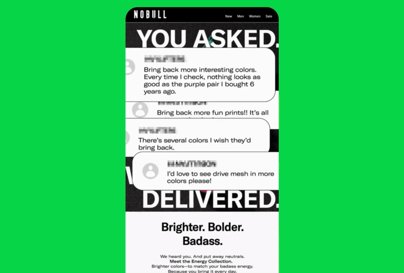
NOBULL uses an animated GIF to put all of their great feedback front and center without having to resort to complex interactive code or a create a never-ending scroll of an email.
But with every GIF comes a risk. What feels “animated” in your browser might be broken or static in someone else’s inbox:
- Outlook will only show the first frame of the animation
- Gmail compresses animated GIFs which can alter color depth
- Mobile networks throttle big files
How to Test GIFs the Right Way
How can you make sure the animated GIFs in your email look as good to you as your subscribers? Here are a few tips:
- Keep file size under 1 MB. Smaller loads mean smoother playback and fewer deliverability risks due to poor inbox experiences. Free tools like ezgif can help you trim frames or simplify animations to reduce overall file size.
- Design a first-frame fallback. If animation fails, that single frame should still communicate your message.
- Preview across real inboxes. Inbox Monster’s Creative Suite shows how your GIF plays (or doesn’t) across major email clients.
- Check speed and looping. A subtle two-loop animation is a much better user experience than an endless strobe that distracts from your CTA.
- Add descriptive alt text. Example: “Animated coffee pour finishing with steaming mug.” It keeps accessibility intact.
Why Background Images Matter and Why They Break
A great background turns an email into an experience. It sets mood, depth and brand personality before a single word is read. Imagine a scroll-stopping background image that guides readers subtly through an email.
They’re more than just a design element. Background images can:
1. Build hierarchy
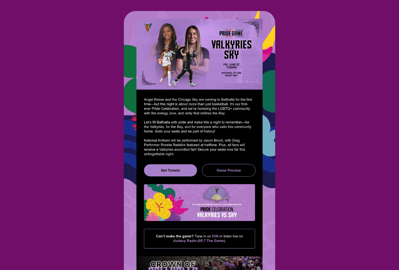
Golden State Valkyries uses a pattern to separate and highlight more important sections, like the hero. Using gradients or patterns like this provides visual interest to encourage the subscriber to keep scrolling.
2. Reinforce branding
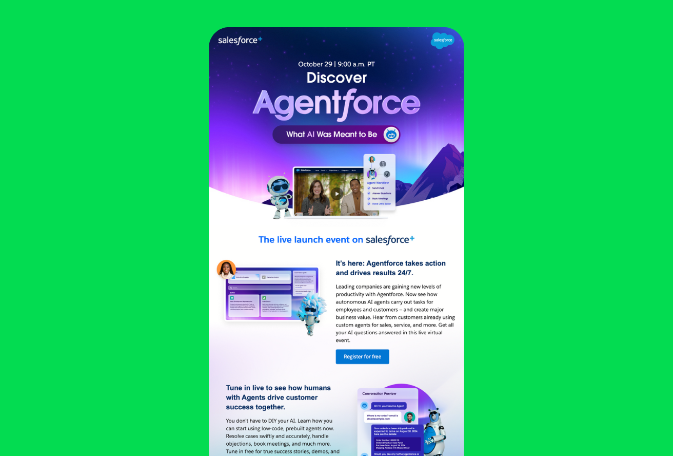
Textured brand colors or imagery create instant recognition, like Salesforce did with this email for their Agentforce event.
3. Mimic real-life texture
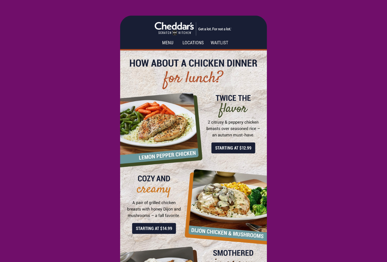
The digital world can sometimes feel a little flat. Cheddar’s Scratch Kitchen fixes that by adding a texture using a background image making their emails more tactile.
But backgrounds are fragile. Outlook on desktop ignores `background-image` CSS altogether. Some mobile apps crop or tile unpredictably. Even dark mode creates challenges as it can invert background colors and wreck readability.
How to Test Background Images With Confidence
Through a combination of fallbacks and canny code, you can make your background images more bulletproof:
- Code hybrid support. Combine HTML and VML so Outlook desktop renders a fallback color or image rather than a blank cell.
- Always set a background-color fallback. Pick a color that maintains legibility if the image doesn’t load.
- Don’t bury text in images. Keep copy as live HTML layered on top so it survives image blocking or inversion.
- Check dark mode inversions. Test side-by-side in Inbox Monster’s Creative Suite to see whether your background darkens or lightens unexpectedly.
- Mind cropping and scaling. Mobile clients may zoom, tile, or clip. Adjust
`background-size`values, retest, and lock in what looks best.
Testing Interactive Content and Why Marketers Use It
[Image placeholder: animation showing carousel working in Apple Mail next to static fallback grid in Gmail.]
Interactive email blurs the line between inbox and landing page. Done well, it transforms passive readers into participants.
Interactivity in email works best to:
1. Boost engagement and dwell time
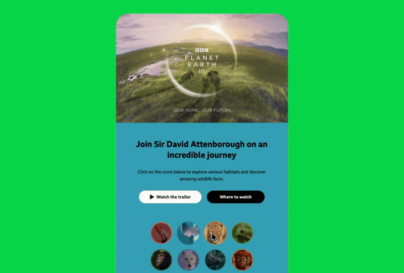
Accordions, tabs or hover reveals let subscribers explore content without leaving the inbox. The BBC’s email promoting the TV show Planet Earth encourages subscribers to stick around with interactive elements and “tap-to-reveal” moments.
2. Shorten journeys
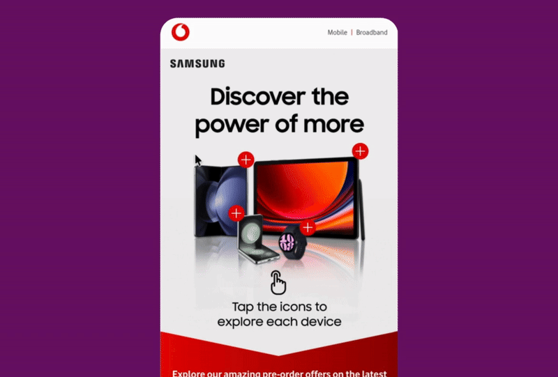
Vodafone uses interactive hotspots to help readers explore Samsung products before clicking through. A wonderful tactic that can move shoppers from curiosity to checkout faster.
3. Differentiate the brand
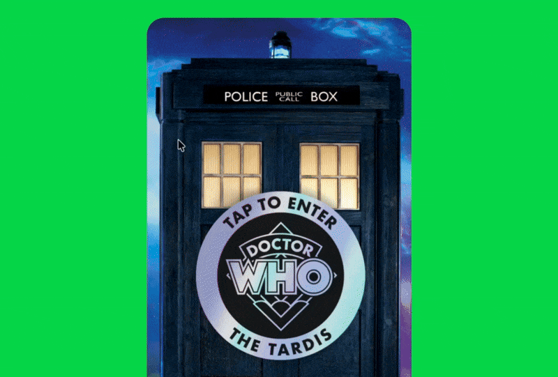
Innovative experiences make you memorable in crowded inboxes. The BBC brings the world of Doctor Who to the inbox with an interactive Tardis in their email.
The trade-off: Support varies wildly. Apple Mail and iOS love interactivity; Outlook and Gmail often strip it out. That’s why fallback design (what shows when interactive code fails to render) is your perfect backup.
How to Test Interactive Emails With Ease
Feel inspired by the examples but daunted by the email testing process? Here are a few tips that’ll make that first interactive email a success:
- Preview both states. Inbox Monster shows the working interactive view and the fallback so you can see exactly what every subscriber experiences.
- Design graceful degradation. If your carousel fails, subscribers should still see clear product images and CTAs instead of broken code blocks.
- Confirm click tracking. Verify that links, UTM tags and analytics fire correctly in both interactive and fallback versions.
- Test load performance. Interactivity can increase your email file size which will slow email load time and lose readers. If it lags, simplify the interactive elements. For example, reduce the number of items in your carousel.
- Validate script safety. Email clients block JavaScript. Stick to CSS transitions or AMP-for-Email components, and test both behavior and blocking in previews.
Easily Test Dynamic Content Built in Movable Ink
If your team builds personalized or interactive experiences in Movable Ink (like live countdown timers, real-time product carousels or weather-based banners), testing those elements can be tricky. Most ESP previews flatten the experience into a static image, so you don’t get a true sense of what subscribers will see.
Inbox Monster’s integration with Movable Ink makes that process far easier. You can see how complex creative and personalized, dynamic content—and their fallback states—behave in real inboxes.
Instead of guessing how your live content will render, you can confirm every version before you hit send. It’s a small addition to your workflow that gives you a big dose of confidence when sending highly dynamic campaigns.
Whether you’re building interactive modules from scratch or using Movable Ink to personalize at scale, testing ensures your investment nets you the results you expect.
Motion, Magic and Measurable Confidence
Motion and interactivity give email life, but only if subscribers actually see them. Testing isn’t about perfection; it’s about predictability. When you know exactly how every piece behaves, you can design boldly without fear of breakage.
Inbox Monster’s unified platform lets you preview animated, background and interactive elements across every major inbox. You’ll see what fails and what fallback displays long before send time.
{{less-time="/blog-ctas"}}