You’ve hit send on what you think is a flawless email. The layout is perfect, the images elevate the design and the call-to-action (CTA) buttons scream “click me” (but not literally). Then your phone buzzes with a message from your boss: “Hey, why is the CTA floating in the header on Outlook?”
Cue the sinking feeling every email marketer knows too well.
Email design mistakes happen to everyone. Outlook creates magical white lines. Dark mode swallows logos. Fonts misbehave. These aren’t signs of bad design, they’re just proof that the inbox is a weird, unpredictable place.
The good news? You don’t have to be a developer to send better-looking, more accessible emails. You just need a solid testing habit (and the right tools to back you up). This guide walks through the most common email design mistakes: why they happen, how to fix them and how testing can keep your sanity intact.
Here’s the TL;DR
Even the best email designs can crumble once they hit real inboxes, but thorough email testing keeps chaos in check. Here’s how:
- Design differences are inevitable. Every inbox renders HTML differently, which means your beautiful layout in Gmail could look unrecognizable in Outlook. Regular render testing helps you catch inconsistencies early.
- Dark mode and accessibility matter. Testing both light and dark versions, plus checking contrast and alt text, ensures everyone can read (and engage with) your message.
- Broken links and oversized files hurt performance. Automated link validation and file-size checks prevent clipping, compliance risks and credibility loss.
- Testing turns “oops” into optimization. Use every test as feedback to improve templates, workflow and creative collaboration.
Inbox Monster brings it all together. From rendering to accessibility to link validation, the Creative Suite gives you one place to test, preview and fix email design mistakes before they reach subscribers.
Why Creative Mistakes Happen (Even to the Best Marketers)
Let’s start with some honesty: Nobody sets out to design a bad email. Most marketers are juggling multiple campaigns, templates and deadlines. You’re moving fast and crossing your fingers that it looks as good in the inbox as it does in your email service provider (ESP) preview.
Unfortunately, every inbox treats your emails differently. Gmail, Outlook, Apple Mail, Yahoo and the rest all interpret HTML and CSS in their own quirky ways. What looks perfect in one might break spectacularly in another.
And since most marketers aren’t hand-coding emails from scratch, even the simplest email template can sneak in hidden quirks. A single line of CSS or an untested background image can cause layout chaos once it’s out in the wild.
Oops #1: Your Email Looks Different Everywhere
You know the drill. You send a beautifully designed campaign, only to discover a laundry list of differences across major email clients.
This happens because each email client interprets your design’s code differently. Outlook, for example, still relies on Microsoft Word’s rendering engine (yes, that Word), while Apple Mail follows modern web standards. Even small inconsistencies—like padding, font fallbacks or inline CSS—can produce wildly different results.
How to Fix Email Design Issues
Simplicity is the key. Partnered with a strong email testing process:
- Start simple. Stick to single-column layouts whenever possible. Multi-column designs tend to collapse unpredictably on mobile.
- Build your emails with tables, not divs. It feels old-school, but tables are the most reliable structure for consistent spacing across clients.
- Inline your CSS. External or embedded styles are easily ignored by clients like Gmail, which means your padding, fonts and background colors may disappear.
- Run render tests after each design change. Don’t wait for the final version: Test while you build. This saves endless revisions later.
- Use test results as shared truth. Show your creative and dev teams exactly what subscribers see. It turns “I think it looks fine” into “Here’s what’s broken and why.”
Oops #2: Dark Mode Turns Your Design Into a Horror Show
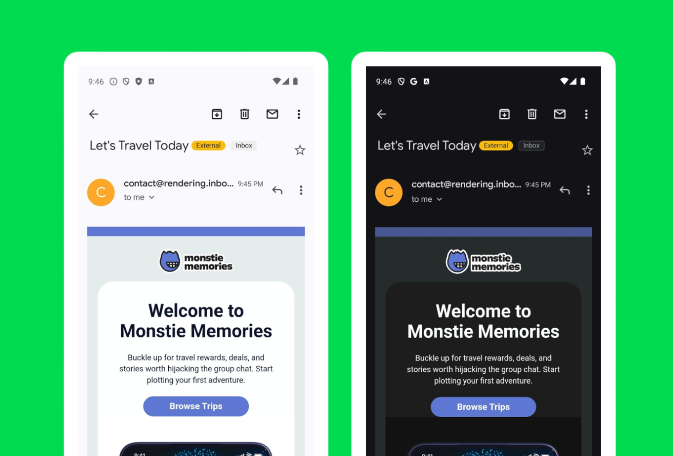
You designed a bright, colorful campaign. It looks amazing. But when you switch to dark mode your logo vanishes, the text blends into the background and your CTA button turns invisible.
In the email world, dark mode doesn’t follow a universal standard. Some clients invert colors automatically, some adjust text only and others make no changes at all. So the same email can look elegant in Apple Mail’s dark mode and completely different in Outlook.
Inbox Monster’s dark mode email previews tests show your email side-by-side in light and dark mode across major clients. No need to guess what shade of nightmare your audience might be seeing.
How to Fix Dark Mode Issues
Knowing that there’s a difference in how email clients interpret dark mode is a great first step to fixing those pesky dark mode issues. Here’s what else you should keep in mind:
- Design for both light and dark from the start. Avoid color combinations that depend entirely on a white background.
- Outline transparent images. Add a subtle stroke around white or light logos so they don’t vanish on dark backgrounds.
- Avoid using pure black (#000000) or pure white (#FFFFFF). Slightly off-white and dark gray tones adapt better to different clients.
- Save alternate versions of your logo. Keep a light and dark logo ready to swap depending on the background color of your email.
Oops #3: Accessibility Gets Overlooked
Accessibility isn’t just a compliance checkbox—it’s how you make sure everyone can actually read and engage with your emails. And it has real business impact, too. More accessible emails mean better engagement, and better engagement helps your deliverability.
Think about text contrast, font size, and how screen readers interpret your layout. Missing alt text or poorly structured headings can make your email frustrating—or impossible—to navigate for people using assistive technologies.
The World Health Organization estimates that 1.3 billion people live with some form of visual impairment. That’s not a niche audience—it’s your audience.
How to Check for Email Accessibility Issues
Don’t worry. You don’t have to completely redesign your email templates to ensure email accessibility. Here are a few easy steps you can take for more accessible—and engaging—email campaigns:
- Check color contrast. Text should have a contrast ratio of at least 4.5:1 against its background. Dark text on a light background is usually safest.
- Add alt text for images. Describe what’s in the image (“Product photo: red sneakers on white background”) rather than writing “image” or “photo.” Not all images need alt text. Images that are purely for decoration should have empty alt text.
- Use a logical heading structure. Screen readers rely on clear order (H1 → H2 → H3).
- Avoid “click here.” Link text should describe what happens when someone clicks. Make it contextual instead.
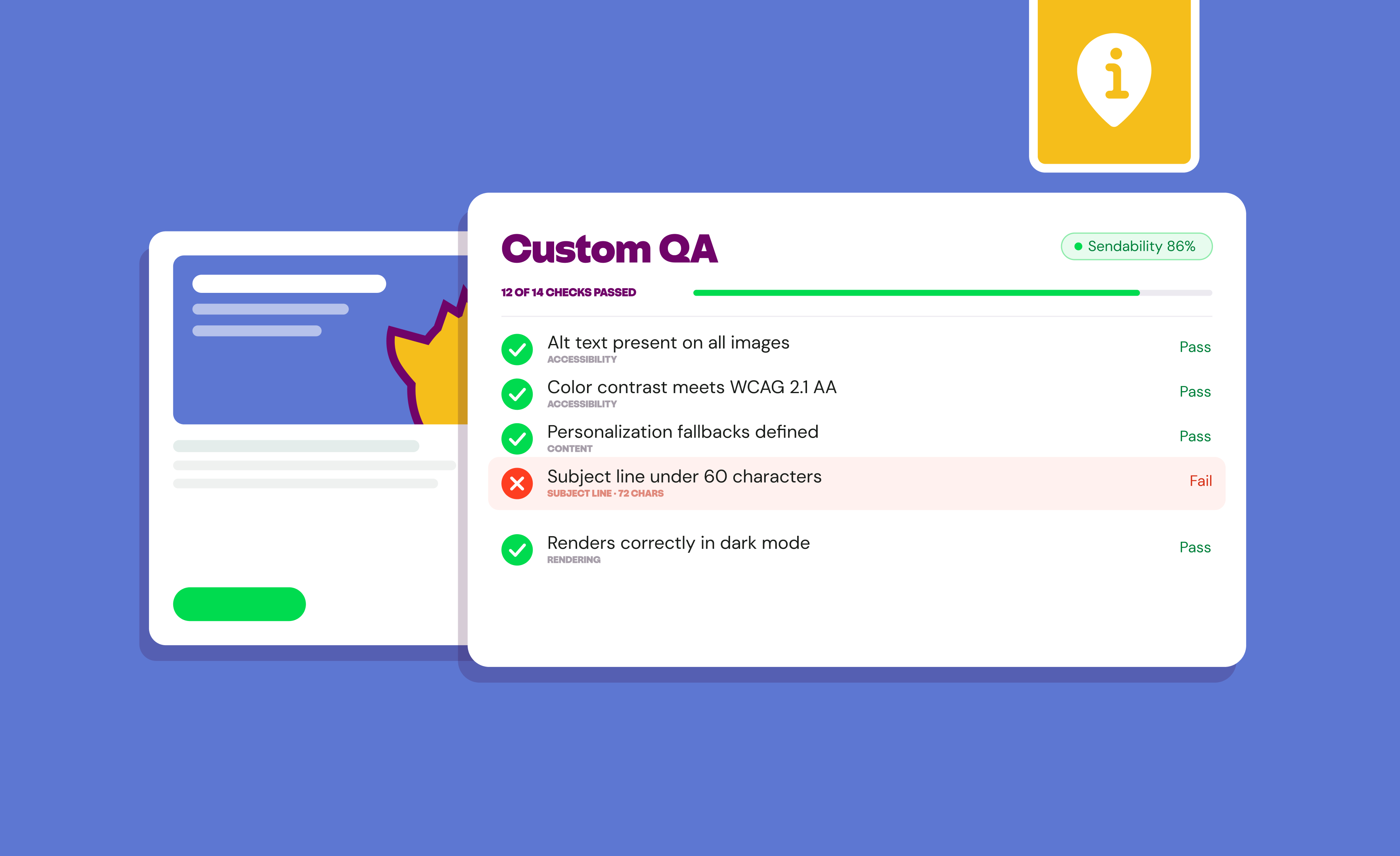
- Run an accessibility test. Inbox Monster’s Accessibility Checker scans for missing alt text, contrast issues and structure problems.
{{eaa-lowdown="/blog-ctas"}}
Oops #4: Broken Links and Missing Images
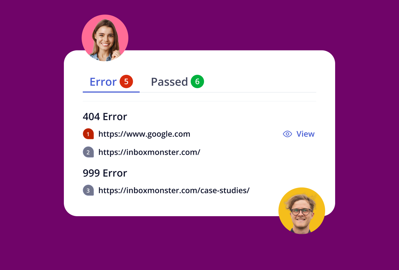
There’s nothing like the embarrassment of a big “Shop Now” button that leads to a 404 page. Or an image that refuses to load on the most important section of your campaign.
Broken links don’t just frustrate subscribers and chip away at brand trust—they can also break tracking. And missing images can wreck your layout, especially if key messaging is embedded in visuals.
How to Find and Fix Broken Links and Images
Being proactive is the best solution for finding and fixing broken links and images in your emails. Here’s a shortlist of things to keep an eye out for:
- Double-check merge tags, dynamic links and tracking code. Make sure personalization tokens or analytics tracking don’t interfere with how the links work.
- Host your images properly. Keep assets in a secure (https) environment, not on a staging server that might block access.
- Run automated link validation. Inbox Monster checks every link and image path before send, flagging issues instantly.
- Collaborate visually. Share test results with your CRM and creative teams so fixes happen before launch day, not after.
“We used to have a whole string of feedback emails on a piece of creative. Keeping track of it was difficult, to say the least. They seem like small problems, but they definitely add up,” said Liza from Virgin Voyages. “But now the team can easily share creative tests to stakeholders, reducing overall production times dramatically. It’s just smoothed out the process. And also eased concerns about variations across browsers or devices.” ~ Liza Herth, Head of Customer Lifecycle Marketing at Virgin Voyages
Oops #5: Bloated Code and File Size Bloat
You may rely on drag-and-drop tools to help you build emails. For good reason. They’re quick and easy to use—and don’t require HTML or CSS knowledge. But those tools can also inject extra HTML and unnecessary inline styles that quietly increase your email’s weight.
Why does that matter? Because Gmail clips emails larger than 102 KB. When that happens, your message gets cut off, and your unsubscribe link may disappear which is bad news for compliance and engagement.
Tips to Keep Email File Size Down
Reduce bloat to ensure your email appears in its entirety across all clients using these tips:
- Keep layouts lean. Use one or two hero images, avoid stacking multiple background images and limit the number of nested elements. Single-column layouts are your friends here!
- Delete unused styles. Clean up leftover code from duplicated content blocks.
- Run a pre-send test. Inbox Monster flags large files so you can trim down before Gmail does it for you.
- Monitor clipping over time. If open rates drop suddenly on Gmail, file size could be the culprit due to the open tracking pixel being clipped.
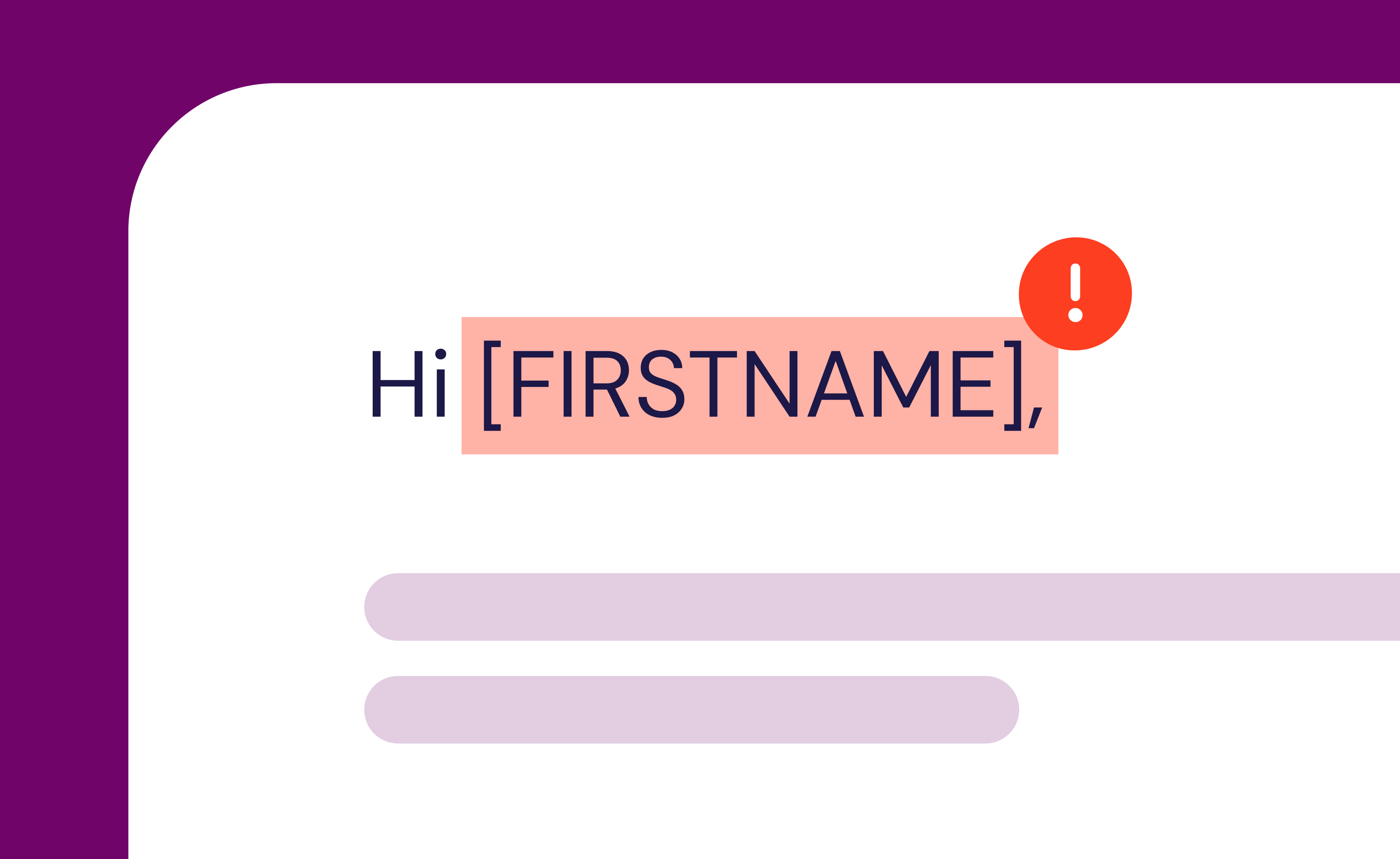
Oops #6: Overlooked Personalization Tokens and Merge Tags
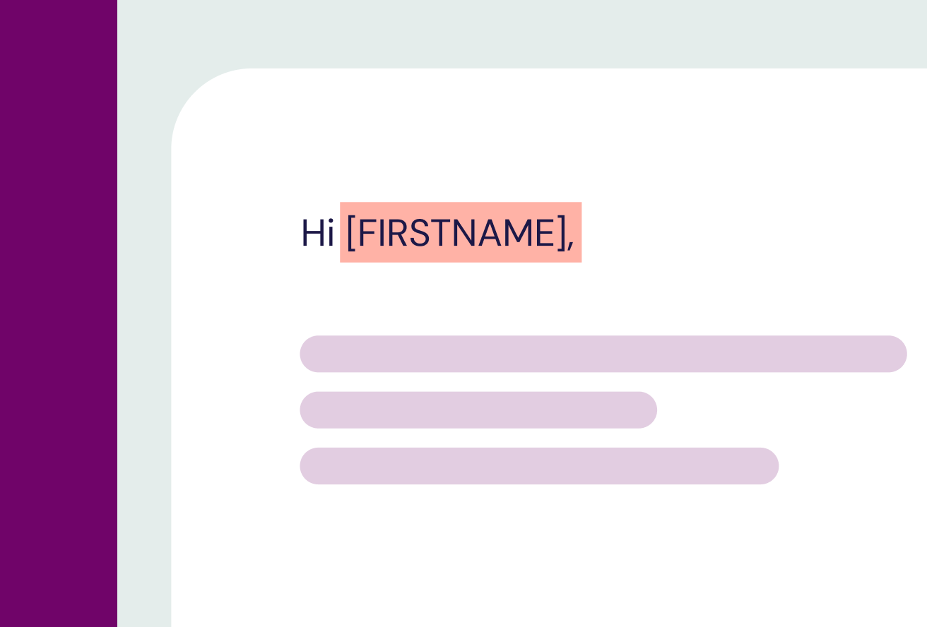
Nothing kills a personal touch faster than “Hi [FIRSTNAME]!” showing up in a live send.
Sometimes merge tags don’t resolve because of a missing field, mismatched syntax or ESP quirks. The best way to avoid it? Test with dummy data before you send.
How to Fix Personalization Issues
Knowing the potential hiccups that can come with email personalization is the first step to stopping them in their tracks:
- Test with dummy data. Load a small test list in your ESP with sample names, cities and purchase info.
- Check merge-tag syntax. Each ESP uses a different format (e.g., {{first_name}} vs. %FIRSTNAME%). Make sure your tags match your platform.
- Set fallback values. For example, “Hi there” if no first name is present.
- QA the data source. If personalization pulls from your CRM, make sure those fields are populated correctly before the campaign goes live.
{{personalize-scale="/blog-ctas"}}
Oops #7: Your CTA Isn’t Visible (or Clickable)
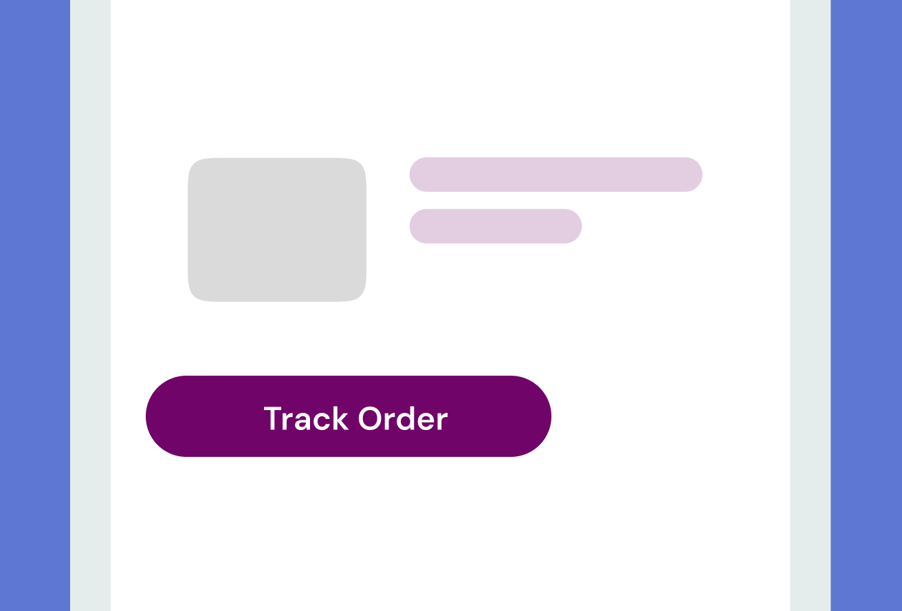
Your CTA is the whole point of your email. But poor design choices can make it invisible or unclickable. Leading to confused subscribers left wondering where to go next.
The good news is you don’t have to switch to inaccessible, all-image CTA buttons to avoid typical CTA issues.
How to Fix CTA Button Issues
Ensure your subscribers can easily engage with the CTA buttons in your email using these tips:
- Use bulletproof buttons. Code buttons with HTML and inline styles rather than images so they render everywhere—and can be read by screen readers.
- Make it tap-friendly. On mobile, aim for at least 44x44 pixels and plenty of padding around the button.
- Check color contrast. Buttons should stand out from the background and surrounding text.
- Test hover and active states. Some clients remove these, so don’t rely on hover color alone.
Turn Creative Testing Into a Habit
Think of testing as creative insurance. It protects your work and your reputation. But it’s more than a safety net—it’s how the best teams continually improve.
Testing data isn’t just for troubleshooting. Over time, it shows which templates are most stable, which ESP quirks you need to plan around and where design consistency can improve.
Teams that make testing part of every campaign workflow send better emails, faster, with fewer back-and-forth revisions.
Inbox Monster’s unified dashboard combines render previews, accessibility checks and link validation in one place. No more juggling. Just smoother sends and happier teams.
{{less-time="/blog-ctas"}}
Email Design Testing FAQ
Do I need to know HTML to fix these issues?
Nope. Most fixes can be handled with a drag-and-drop editor once you know what’s breaking. Testing gives you visual proof of what needs attention, so you can collaborate with developers when needed. But you don’t have to become one.
How often should I test my email designs?
Every time something changes: a new layout, updated logo, or even a new ESP. If you’re reusing the same template, a quick pre-send test keeps you confident nothing’s shifted.
Can testing help improve deliverability?
Absolutely. A clean, accessible and well-rendered email drives more engagement, which inbox providers reward with better inbox placement.
How do I test for email accessibility?
Run your design through an accessibility checker (like Inbox Monster’s). It scans for color contrast and missing alt text, giving you clear steps to fix issues fast.
How can I test to see my email design in dark mode?
Dark mode behavior varies wildly across clients, so the only way to know for sure is to test. Inbox Monster’s dark mode preview shows how your design appears in every major inbox, side by side with light mode.